Perfecting Your Product Listing Pages
Building solid, optimized product detail pages (PDPs) is a must for any brand or retailer. After all, the PDP is where consumers decide to convert (or not).
Conversion is the ultimate goal. And there are certain factors – including the presence of reviews – that positively impact conversion on the PDP. In fact, we recently compiled an entire guide that explores the 10 must-haves for PDPs that convert.
But before you convince shoppers to convert on your PDPs, you must first get them there.
Of course, no two shoppers approach the purchase journey in the same manner. Instead, consumers might happen upon your product pages in any number of ways. In this guide, we’ll zoom in on one of the most common ways: the product listing page (PLP).
Read on to explore why PLPs matter, and learn 14 key components that’ll improve the performance of yours (with plenty of real-life examples of these components in action).
The PLP: A Key Stop on the Road to Conversion
If you work for a brand or retailer, you’re likely familiar with the concept of a PLP. If you’re not (or if you need a refresher), PLP stands for product listing page. You may also hear it referred to as a category page.
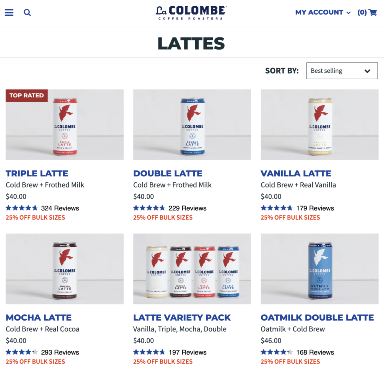
Essentially, a PLP is a page on an ecommerce site that provides a list of products based on a category or search term. For example, this is a PLP that a consumer reaches when they click on “lattes” in the menu of a coffee brand’s website.
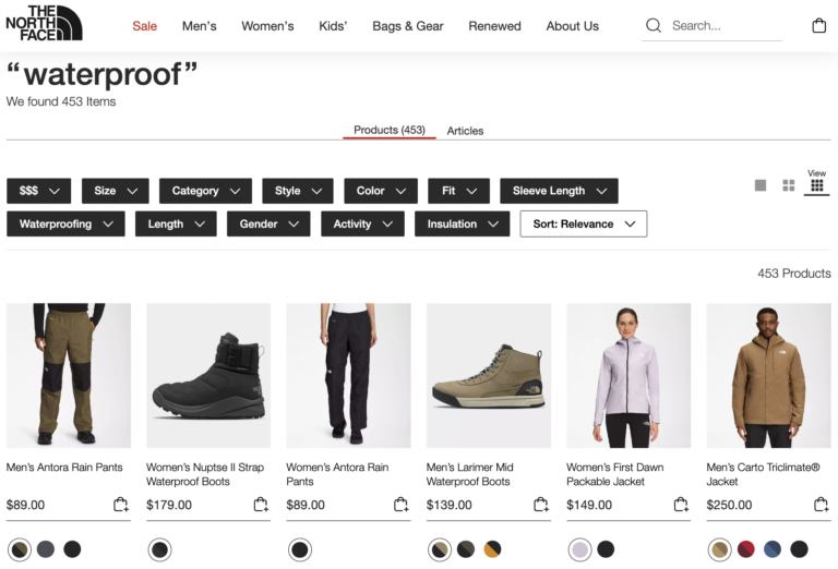
And here’s a PLP that displays all results that match a search term of “waterproof” on an apparel website.
Typically, brands and retailers focus a lot of attention on optimizing their product detail pages (PDPs). That makes sense, as an optimized PDP is key to boosting conversion.
But all too often, PLPs don’t get the same amount of love from brands and retailers. And that’s a big mistake.
PLPs are a key point on the road to conversion. It’s on the PLP that a shopper decides whether to delve deeper into specific products – or take their search in a different direction.
A poor PLP experience can scare a shopper right off your site. So it’s important to get it right.
The Ideal PLP
The truth is, there’s no one-size fits all formula for a PLP. Rather, it depends on myriad factors including product type and industry. The most important thing is to find the formula that works best for your business.
That said, there are common characteristics across the most effective PLPs. Let’s take a look at what “good” looks like. Then, we’ll take a deep dive into each individual component.
- Mobile Friendly
- Descriptive Header
- The right number of products
- Descriptive title
- Compelling imagery
- Price
- Ratings and reviews information
- Variation information
- Product callouts
- Add to cart
- Additional product details
- Sorting capabilities
- Filtering capabilities
- Personalized experience, based on previous shopping behavior
A Quick Caveat
Before we dive deeper into these PLP must-haves, there’s one important thing to note. Great PLPs rely on a solid foundation of comprehensive product data. It may seem obvious, but you can’t showcase information on your PLPs that doesn’t exist!
With that said, let’s take a closer look at the key ingredients of effective PLPs.

1. Mobile Friendly
We know more consumers are shopping online – a trend that accelerated at the start of the pandemic. And a growing portion of those online shoppers are using their phones to browse and buy.
Insider Intelligence predicts that by 2025, mobile commerce (aka m-commerce) is expected to account for 44.2% of retail ecommerce sales in the US.
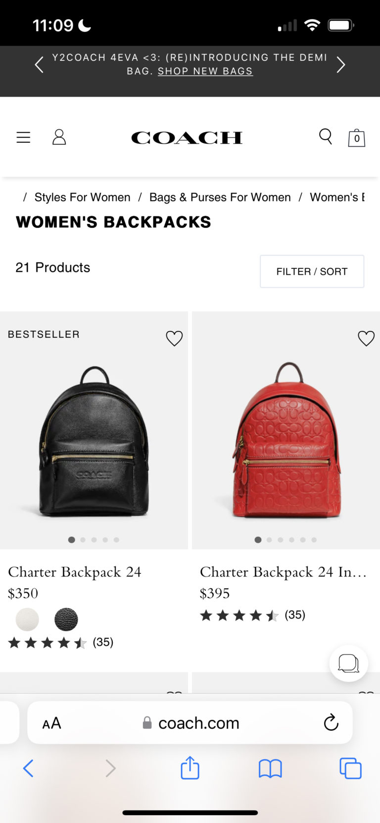
It’s critical to ensure your PLPs are easy to consume on a mobile device. If they’re not, we guarantee you’re going to lose a whole lot of potential customers.
2. Descriptive Header
Think of the header on the PLP like a sign in a brick-and-mortar store. It lets you know what you’re looking at – and invites you to explore.
Some brands and retailers keep their headers simple.
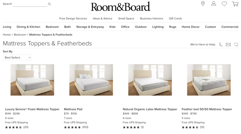
Others take a more visual approach to their headers.
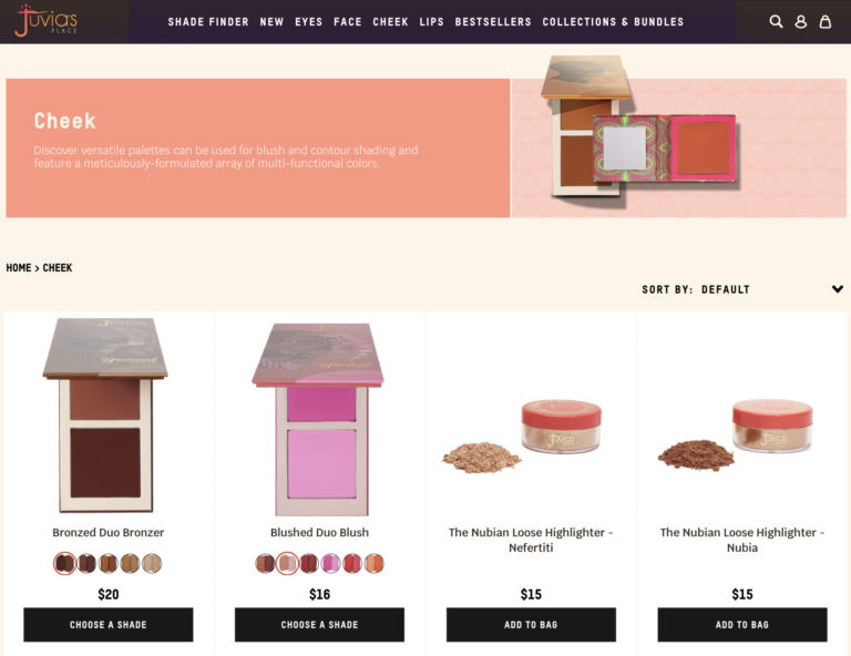
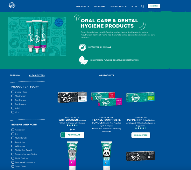
Which type of header is the best approach? It really depends on what’s in line with your brand – and what drives the best results. Whichever approach you take, it’s a good idea to incorporate breadcrumbs. These help shoppers understand where they are on the website – and serve as a secondary navigation as they go through the purchase journey.
3. The Right Number of Products
When you’re developing your PLPs, it’s important to determine how many products you’ll feature on each page. If you feature too many products on a page, it can be overwhelming. But if there are too few, shoppers might get frustrated, too.
So, what’s the ideal number of products to feature per page? According to research from Baymard, the ideal number on desktop sites is between 50 and 150 per page. Obviously, this is quite the large range. Again, the “ideal” depends on a number of factors, so it’s important to test to see what works best for your brand.

On mobile sites, Baymard recommends far fewer products per page; 15-30 is the sweet spot.
Be sure to display the quantity of results available on any given PLP. And make it as easy as possible for shoppers to load results beyond the initial ones. That might involve clicking to the next page, clicking to load more results onto the current page, or automatically loading more results upon scroll.
4. A Descriptive Title
It’s important to have a short, descriptive title for each product that appears on a PLP. That way, shoppers can determine if it’s something they want to learn more about.
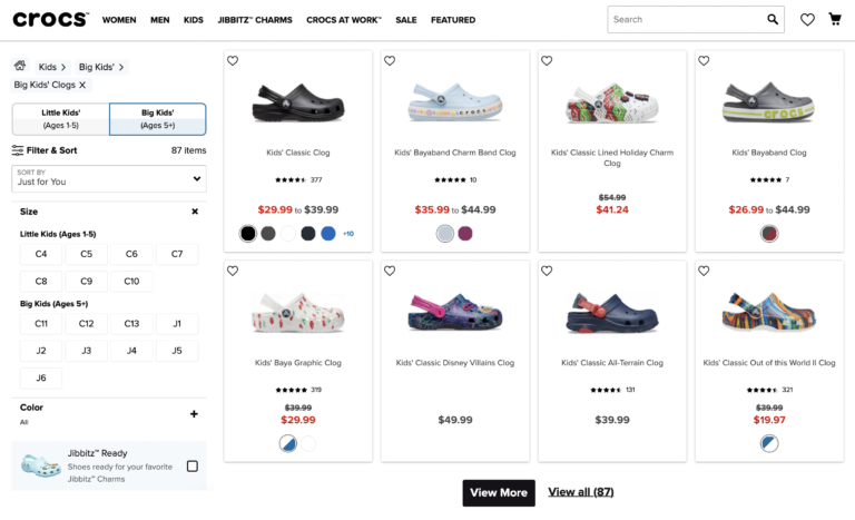
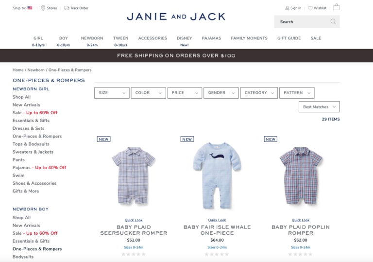
For example, great titles on apparel PLPs can convey information about the fabric of each item.
And the titles for products on a food PLP can provide information on flavor and size.
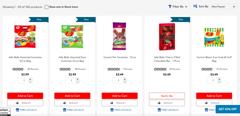
5. Compelling Imagery
Visual content is really important to online shoppers, who can’t touch and see a product prior to purchase. A survey found that 86% of shoppers always or regularly seek out visual content when researching a product to purchase.
Showcasing compelling imagery on your PLPs is like setting up great window displays in your brick-and-mortar stores. This content entices shoppers to learn more.
At a minimum, be sure to include one, great image for each product on your PLP.
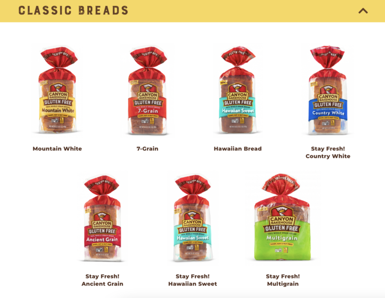
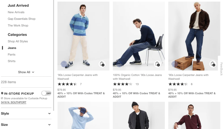
However, you may want to consider additional imagery. Including multiple images can help shoppers understand how the product looks from different angles. What’s more, it can help customers understand what certain product types – for example, clothing and makeup – look like on different people.
One way to do this is to add arrows, which allow the shopper to scroll through the photos available for each product on the PLP.
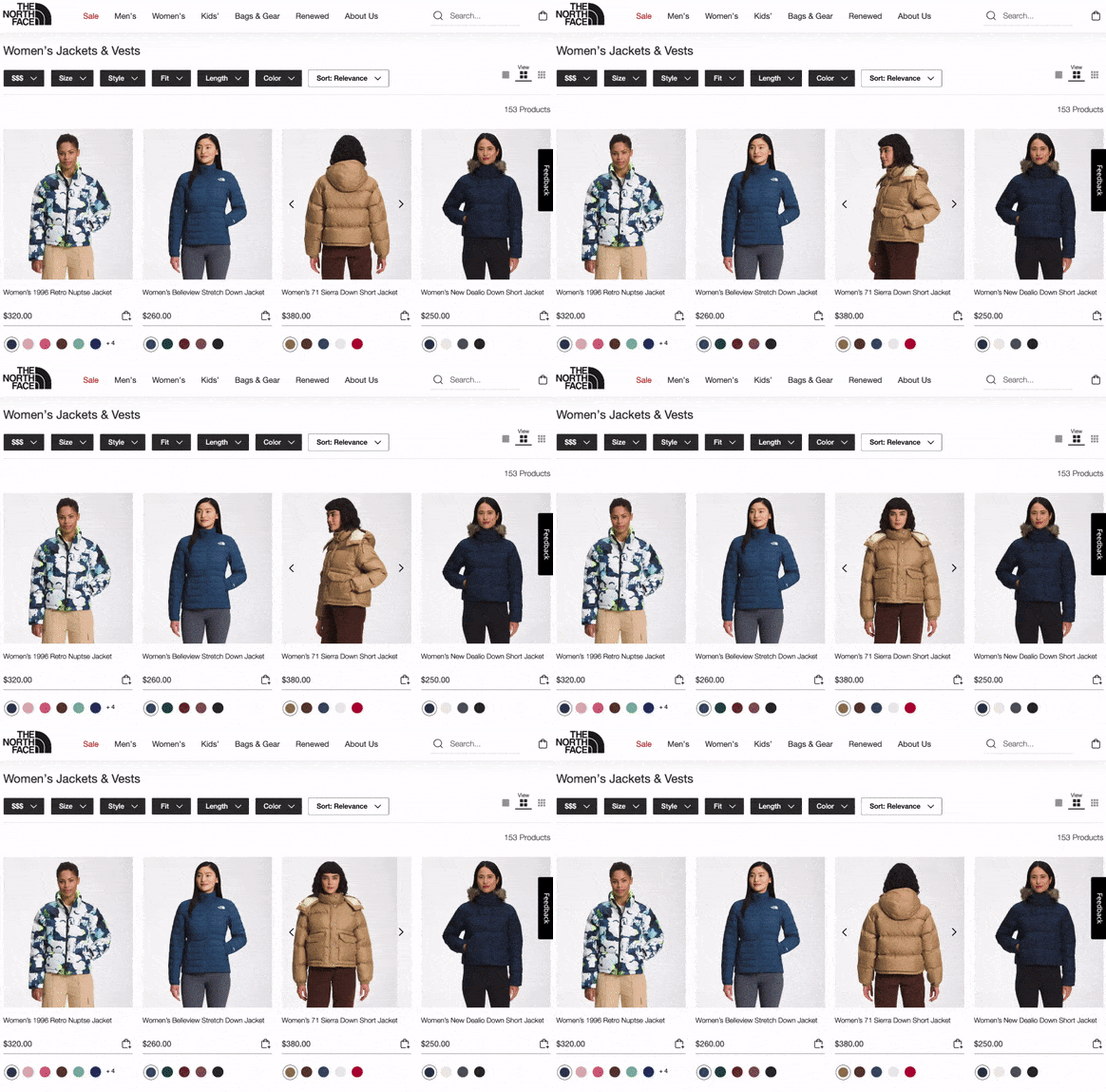
Another option is to display additional imagery when a shopper hovers over the listing on the PLP.

6. Price
It’s no surprise that price is a top factor consumers consider when determining what products to explore. A survey found that 87% of shoppers indicate it’s important.
Make sure you’re upfront about pricing – right on your PLP. If shoppers have to click through to a product page to find out how much something costs, it’ll only cause frustration.
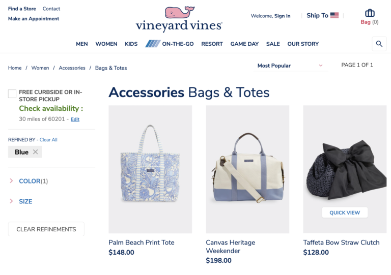
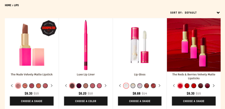
Also, if an item is on sale, be sure to indicate both the regular and sale price on your PLPs. Everyone loves a good deal. And knowing an item is on sale is likely to pique the interest of more shoppers.
7. Ratings & Review Information
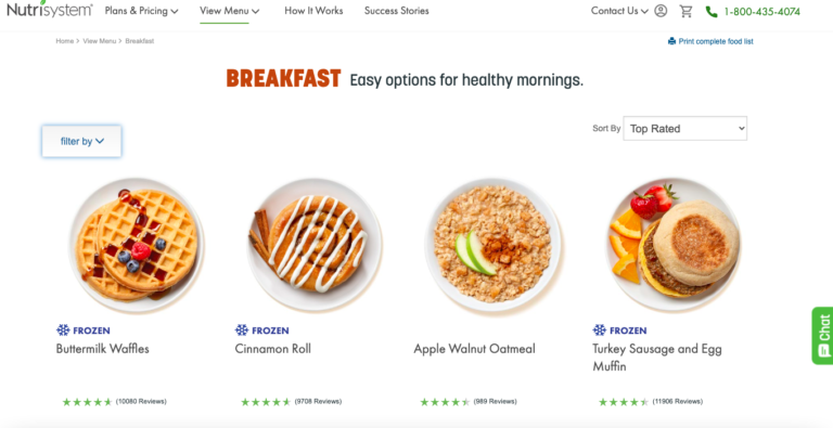
By now, it’s quite clear that reviews play a key role in the purchase journey. On the PDP, reviews give shoppers the confidence to convert. But this content can also entice shoppers to click through to said product page. In fact, a survey found that 82% of consumers rely on ratings and reviews before they land on a product page as a way to determine which products to explore further.
At a minimum, be sure to display the average star rating for each product on your PLPs. This information will give shoppers a great overview of product sentiment. Then, they’re more likely to click through to the product page to dig deeper into the review content.
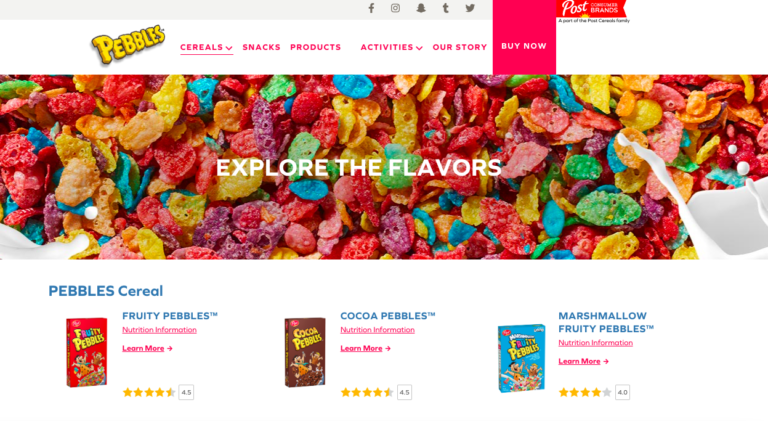
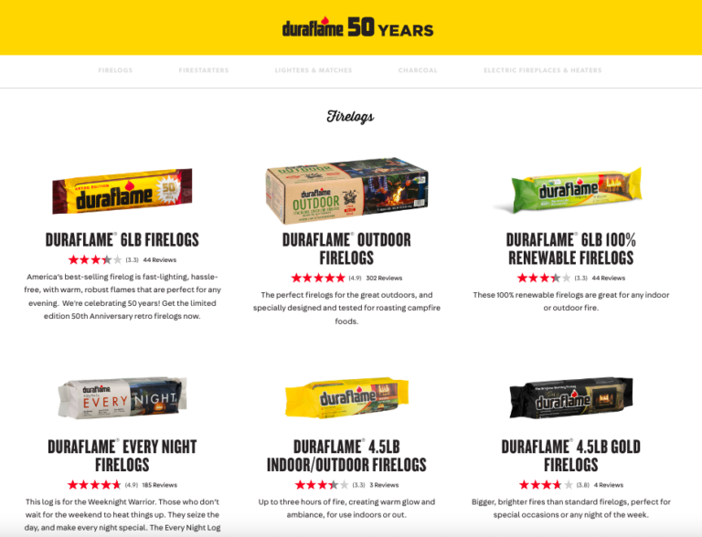
It’s also a best practice to include the quantity of reviews available for each product on the PLP. That information serves as social proof. If a product has a lot of reviews available, a lot of people have purchased it. That means it’s probably worth checking out.
8. Variation Information
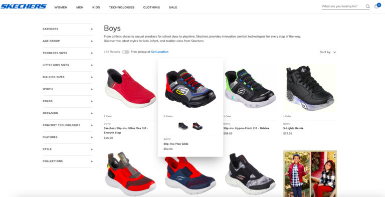
In some cases, there are multiple variations of a single product. For example, a sweater might come in five colors. And a pair of shoes might be available in multiple widths.
Be sure to include that variation information on your PLPs. For example, this shoe brand indicates when a pair of shoes comes in multiple colors. Then, the shopper can see what those colors look like upon hover.
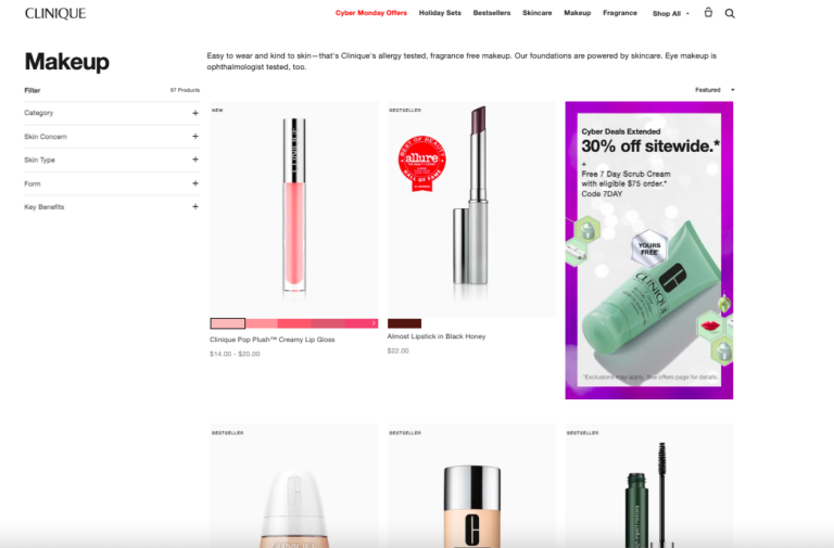
This makeup brand also sells products in different shades. On the PLP, the brand specifies the number of shades each product is available in – and each shade is displayed at the bottom of the listing. If a visitor clicks a particular shade, the main image updates to that shade.
9. Product Callouts
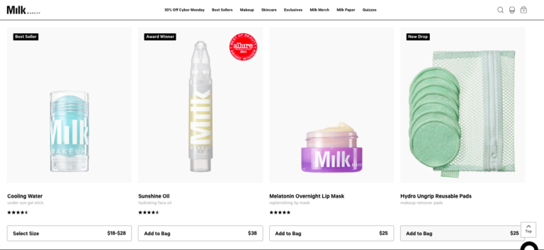
If a PLP has dozens of products listed, it can be easy for a shopper to feel overwhelmed. Including a text or visual call out that indicates something special about a specific product can help guide their journey.
For example, a callout of “bestseller,” “top rated,” or “award winner” lets shoppers know this is a product other consumers love.
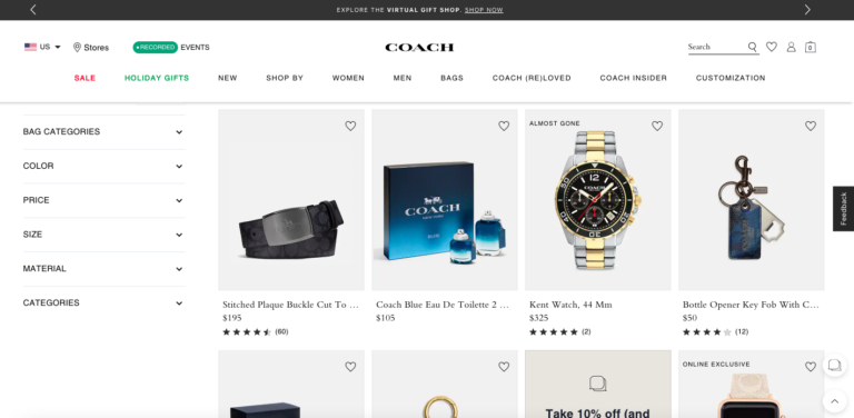
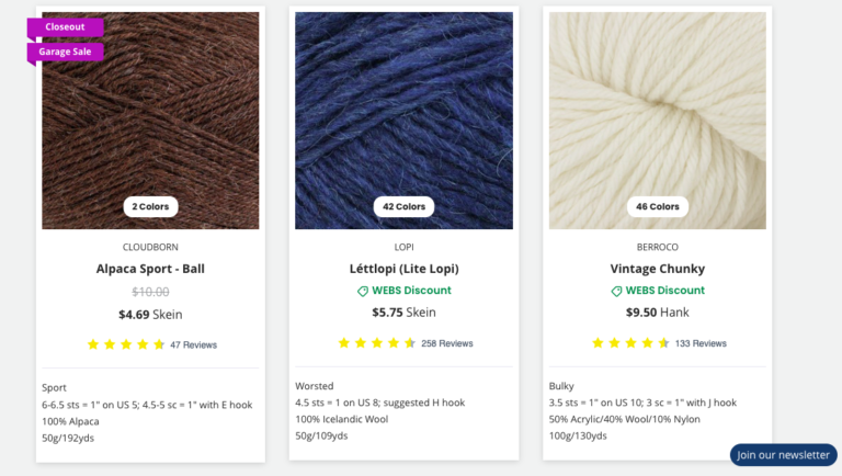
Labels like “almost gone,” “going fast,” and “close out” can create a sense of urgency. This encourages shoppers to learn about a product (and ideally, buy it) right away so they don’t miss out.
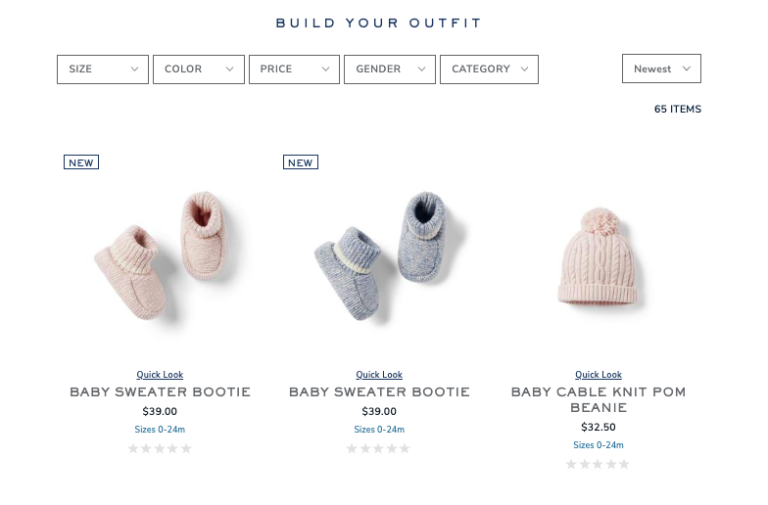
A label of “new” is eye-catching too – especially for repeat customers who quickly want to determine which products they haven’t yet seen.
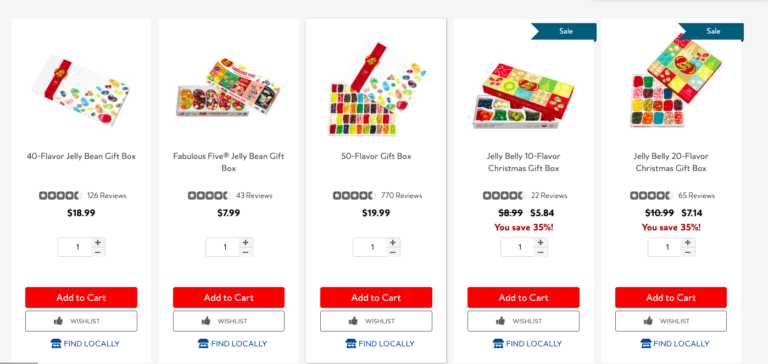
Calling out when an item is on sale is also useful for shoppers on your PLPs. In addition to including a “sale” or “promotion” banner, be sure to include both the sale and regular price of the item.
There may also be opportunities to call out specific features or attributes of your products on your PLPs. For example, you might label products that are organic or sustainable.
10. Add to Cart
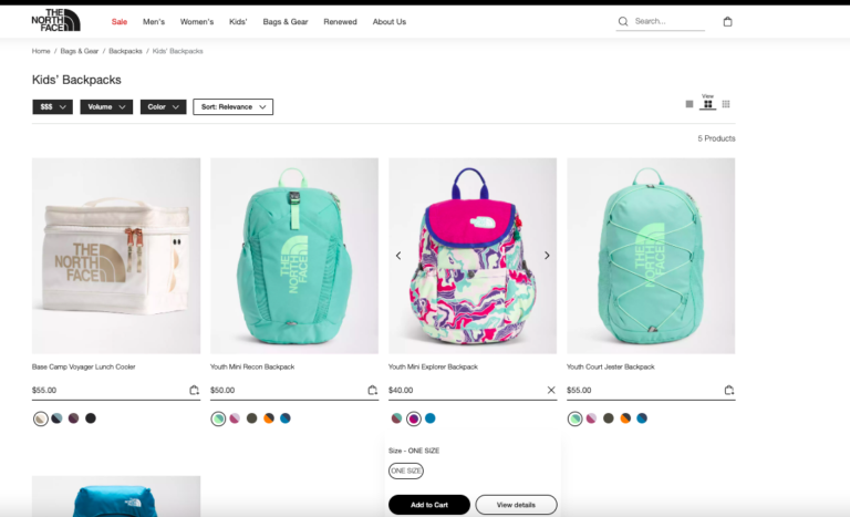
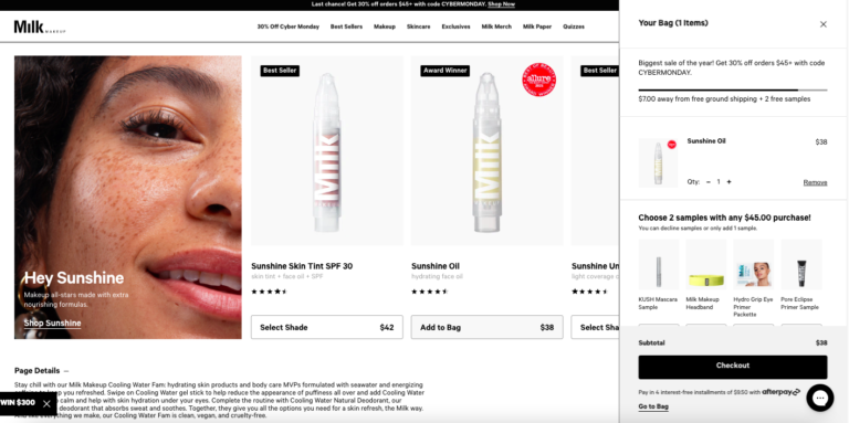
There are times when a consumer may be able to find all the information they need about a product without leaving the PLP. So, be sure to include an “add to cart” button to each item on the PLP. This will eliminate the extra step of going to the PDP – and accelerate conversion.
11. Additional Product Details
Oftentimes, a shopper might want more details about a product. But they’re not quite ready to navigate to the PDP.
Consider adding functionality to your PLPS that allows consumers to get more information about a specific product, without navigating away from the PLP.
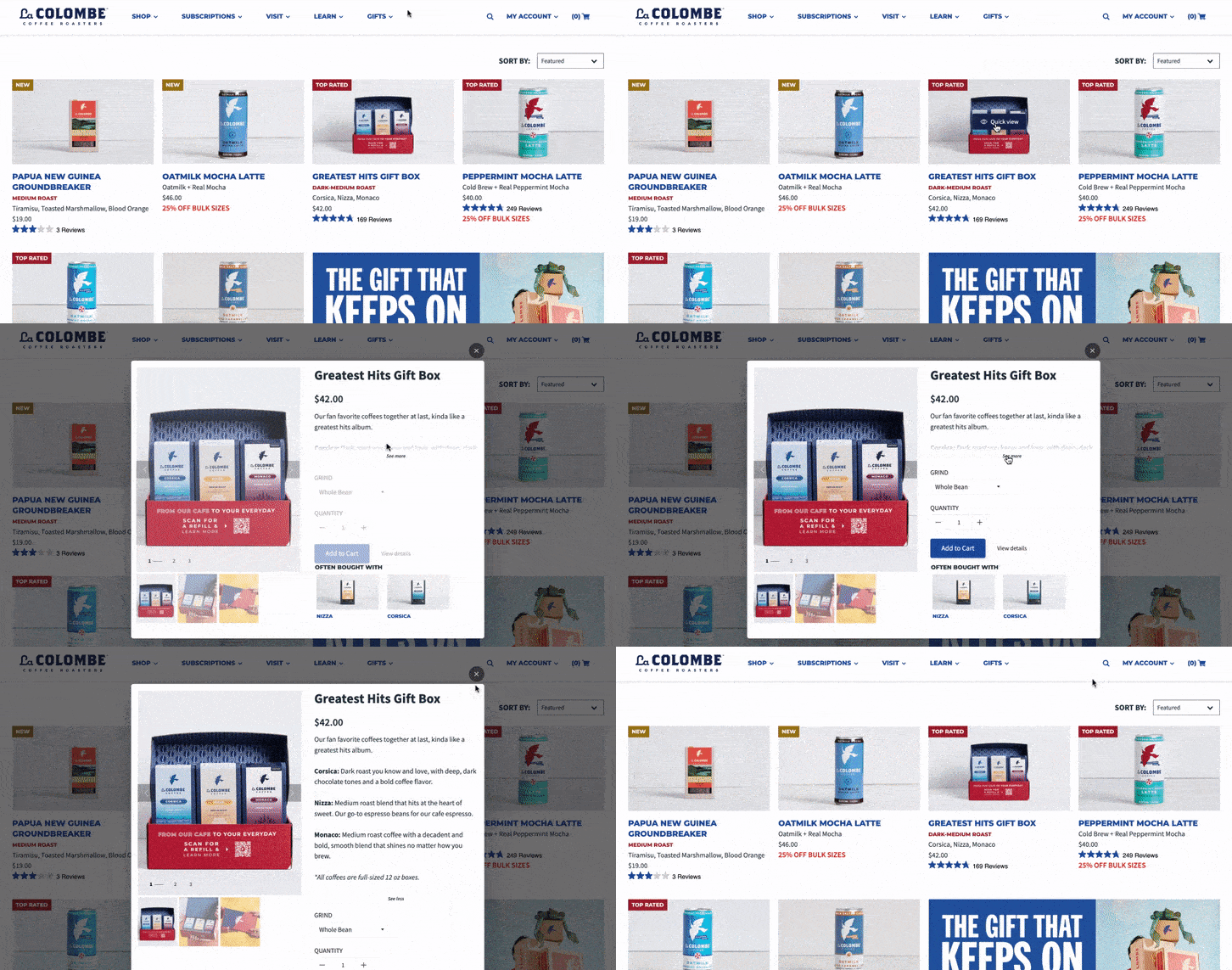
One option is to include a “quick view” or “quick shop” button, which will open a pop up with more information about the product in question. The shopper can learn more about the product, click through to the product page, or even add the product to their cart without navigating away from the PLP. According to Baymard, this approach is particularly effective for products that are visual in nature.
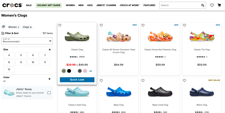
Another option is to display additional product information upon hover – such as color options. According to Baymard, this technique results in visitors spending more time on relevant product pages – and a higher overall rate of success for the ecommerce brand or retailer.
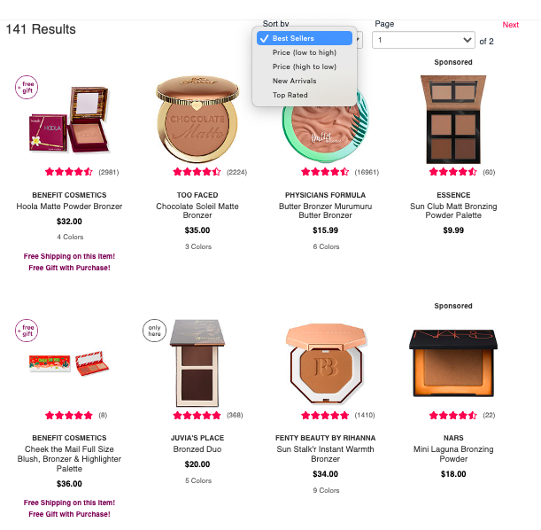
12. Sorting Capabilities
Consumers consider myriad factors when determining which products they want to explore. Those factors vary from shopper to shopper. While some seek out the latest and greatest, others prefer proven products loved by others like them.
Provide robust sorting capabilities on your PLPs that allow shoppers to more quickly hone in on the products that’ll fit their needs. A few sorting options you’ll want to include are:
- Featured products
- Price
- Best sellers
- Top rated
- New
13. Filtering Capabilities
Filtering is another key way shoppers zero in on products that are worth exploring. So be sure to include robust filtering capabilities on your PLPs.
Some basic filters to incorporate include:
- Color
- Size
- Pricing “bucket”
- In-store availability
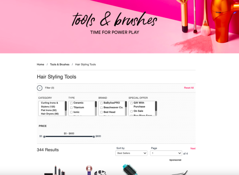
In addition, consider adding filtering capabilities that are specific to the types of products you sell. For example, on a PLP for hair styling tools, it makes sense to allow shoppers to filter results based on category, brand, and type of material the tool is made from.
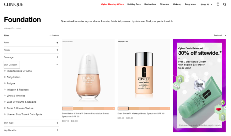
On the other hand, a consumer browsing on a makeup PLP would find it helpful to filter products by factors including skin type, skin concern, and product coverage – among others.
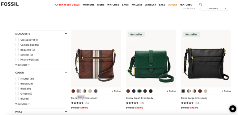
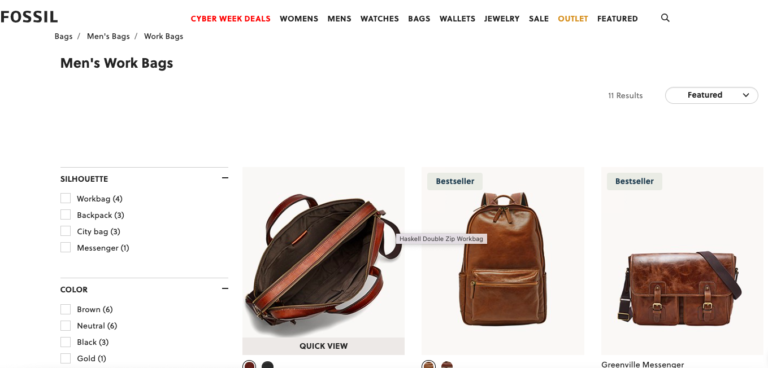
Also, a brand selling handbags might allow shoppers to filter PLP results by factors including silhouette and material.
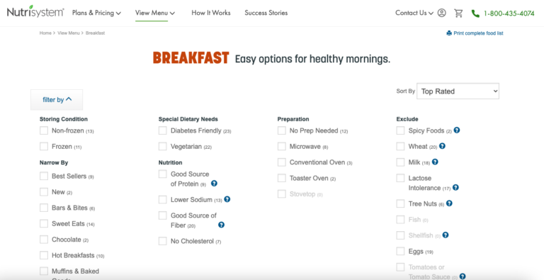
And a brand selling prepared meals might opt to allow shoppers to filter products by preparation method, ingredients, and dietary needs — among others.
What filtering options should you incorporate into your PLPs? The best place to start is to determine what factors consumers weigh when shopping for your products. Then, measure performance and optimize accordingly.
Whatever filtering options you choose, it’s a best practice to ensure your site visitors can easily see which filters are applied at any given time. It should also be easy for shoppers to deselect a filter or filters.
14. Personalized PLP Experiences
These days, consumers are no longer satisfied with generic, one-size-fits all experiences. Rather, they expect the purchase journey to be tailored to them. According to McKinsey & Company, 71% of consumers expect personalization. And 67% place value on a brand’s ability to provide relevant product and service recommendations.
As you get to know your shoppers better, start delivering more personalized PLP experiences based on their past site behavior. For example, serve up the newest products at the top. Another idea is to give top priority to products a shopper has saved to their favorites – or those that complement a product they’ve already purchased.
Go Forth and Optimize Your PLPs
PLPs play a major role in the purchase journey of many shoppers. But all too often, brands and retailers don’t give these pages the attention they deserve.
A well-designed PLP helps shoppers quickly find the products that’ll best fit their needs. This reduces the amount of time it takes for a browser to become a buyer.
On the other hand, a poorly designed PLP will leave your shoppers frustrated – and likely to abandon your site altogether.
It’s essential to ensure your PLPs are built to increase traffic to your product pages – where shoppers can then convert. Of course, there’s no one-size fits all formula for building PLPs that perform. The best approach is to start with best practices outlined in this guide – especially those for your industry. Then, measure and optimize on a regular basis to drive even better results.
Finally, remember that your PLPs are built on a foundation of great product data. So make sure you have rich, comprehensive product data that’ll fuel great experiences on your PLPs.


