If there’s one thing we feel we can speak authoritatively on (if we do so say ourselves), it’s best practices for showcasing User-Generated Content (UGC) in your product display pages.
Specifically: Exactly what information should you include and why?
To answer this question effectively, it’s worth explaining the point of UGC. Before making a purchase, consumers want validation for their decisions from a trusted source. And what could be a more trusted source than an independent third-party (i.e. customers) who have already experienced the product in question?
UGC weaves the Voice of the Customer throughout your site, for greater authenticity and customer-centricity. UGC adds functionality and utility to your website to support the buyer journey, and in doing so, it provides critical social proof that turns shoppers into buyers. In other words, the main benefit of UGC is that it maximizes conversions and drives sales.
At PowerReviews, we analyze extensive volumes of web traffic to understand what types of UGC have the most impact on the buyer journey. More than three-quarters of online shopping traffic across all our clients consume at least some form of UGC (i.e. visual media, Q&A, reviews, ratings), and the results of those interactions are quite compelling. In fact, across all this web traffic, online shoppers that interact with some form of UGC are actually 103% more likely to make a purchase.
I work with a bunch of leading brands that leverage a range of UGC to drive conversions. Here are the UGC that have the biggest impact, along with some real-life examples.
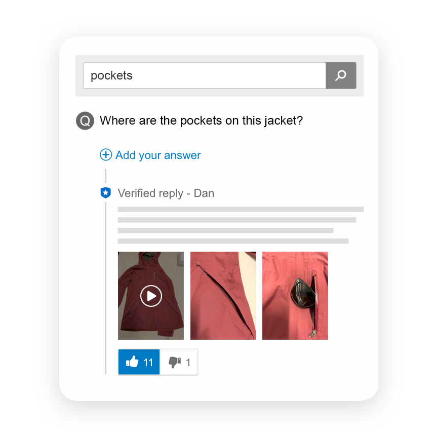
Q&A provides the opportunity for customers to provide specific questions about a product on your product pages. You can then answer these questions yourself or allow other customers to provide responses.
Q&A gives shoppers answers to the very specific questions they have before making a purchase. In doing so, it boosts confidence and removes hesitations to buy – absolutely critical when aiming to convert browsers to purchasers.
Q&A also enables you to bridge the content and contextual gaps often not covered in standard online product descriptions. Think questions about various use cases, product compatibility, warranty and how the product performs in given scenarios. You 1) can’t cover all these topics in your product descriptions and 2) can’t anticipate every question your customers may have. So crowdsourcing these questions in a mini and highly specific online forum is the next best thing.
Our research shows Q&A is the No. 1 most impactful type of UGC content. Consumers engage with this content convert at 153% the rate of overall site traffic.
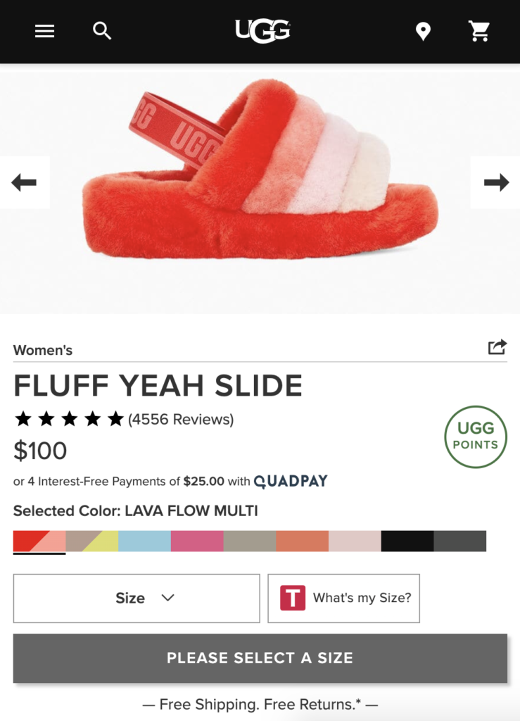
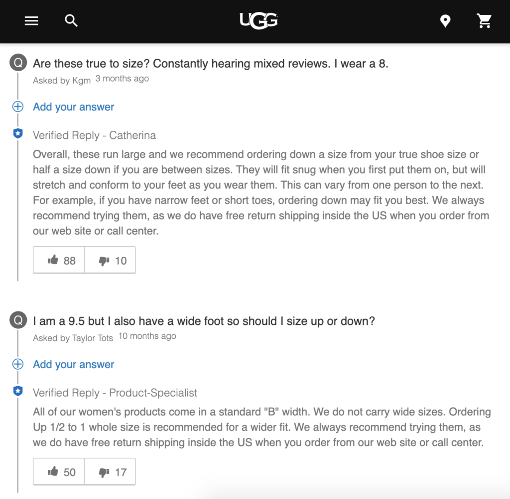
If you’re looking for a retailer with a solid Q&A foundation, check out global footwear mega brand UGG. The retailer has 34 questions in its Q&A for its 5-star rated Fluff Yeah Slide. Shoppers can ask a question, sort responses by various criteria – newest, oldest or most answers – and also search by keyword.
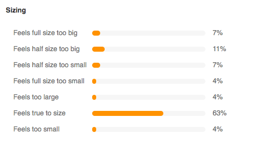
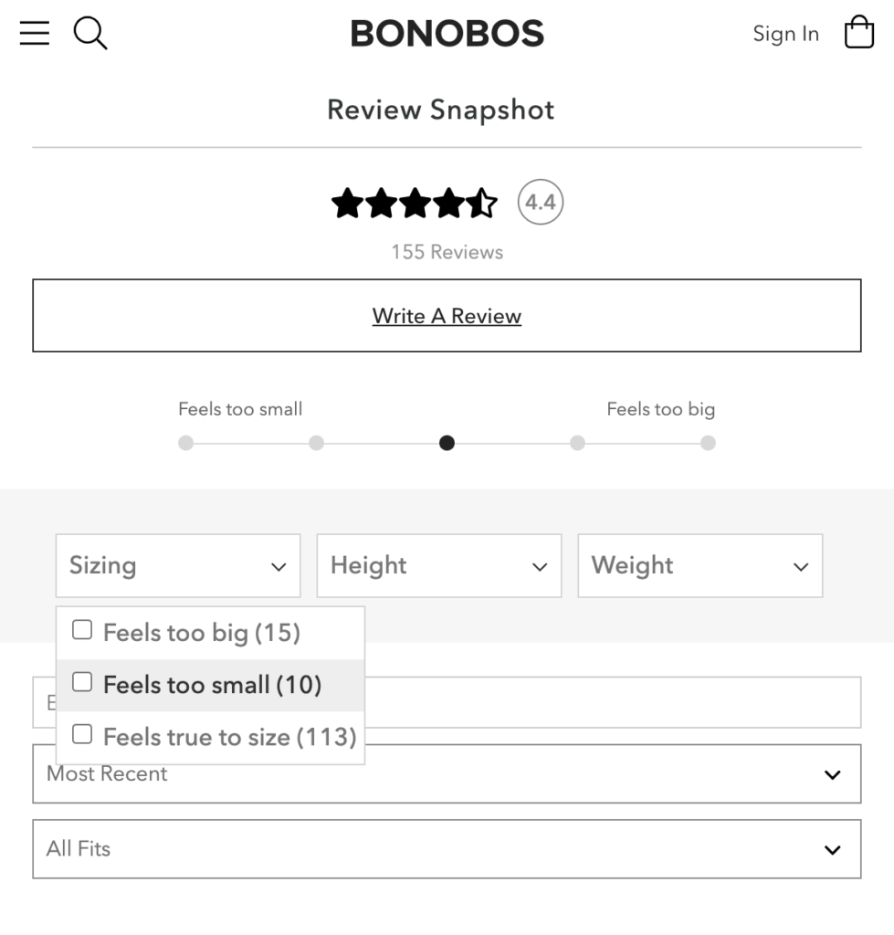
The ability to sort review content according to consumer sizing reactions. Is the item coming up smaller than anticipated, larger or just right? Receiving this information from people who have actually bought and tried the item provides authentic guidance you simply cannot replicate.
Consumers who interact with review content drive a 115% increase in visitor conversion rate per our research. The Size/Fit Snippet is a great way to facilitate this interaction. Why? It gives shoppers the ability to filter reviews to bring the most relevant review content front and center.
Studies show consumers will pay a premium for products that are personalized to their specific needs. Think of the Size/Fit Snippet in the same manner – consumers place a premium on user generated content that is personalized to their specifics.
If you’re an apparel or footwear brand in particular, the Size/Fit Snippet is a “must have”. Presenting reviews in this manner is a win-win for retailer and for the customer. It elevates consumer confidence whey they can’t touch or try on a product but want to ensure it will still look and feel great; as well, it acts as an excellent qualifier thereby significantly reducing the likelihood of return.
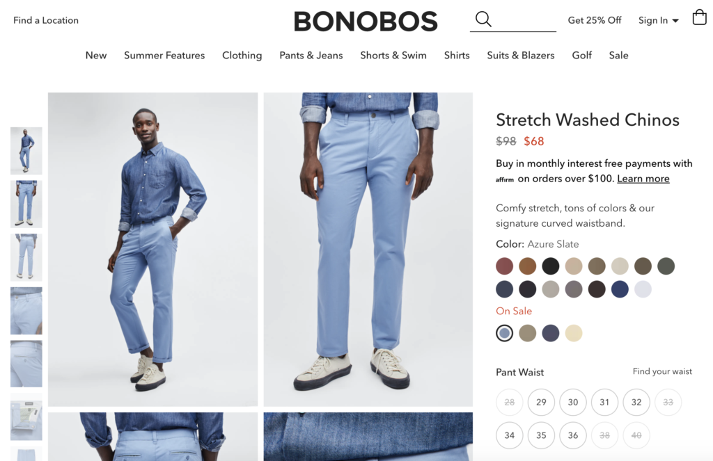
To see a great use of the Size/Fit Snippet in action, check out Bonobos. The men’s clothing designer and retailer’s claim to fame is that it offers “the most fits in pants – Skinny, Tailored, Slim, Standard, & Athletic – across sizes 28-54 so you’re bound to find the right fit.” To support this value proposition, the company offers copious size and fit information resources on its website.
On its Stretch Washed Chino product display page, 155 reviews can be sorted by Size (Too big, too small or true-to-size fit), Height (options from 5’4” to over 6’4”), and Weight (options from under 150 to over 300 pounds).
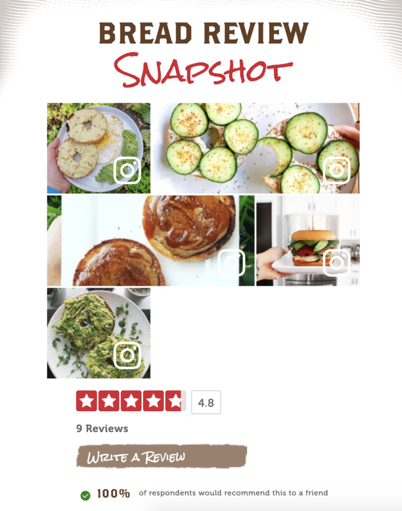
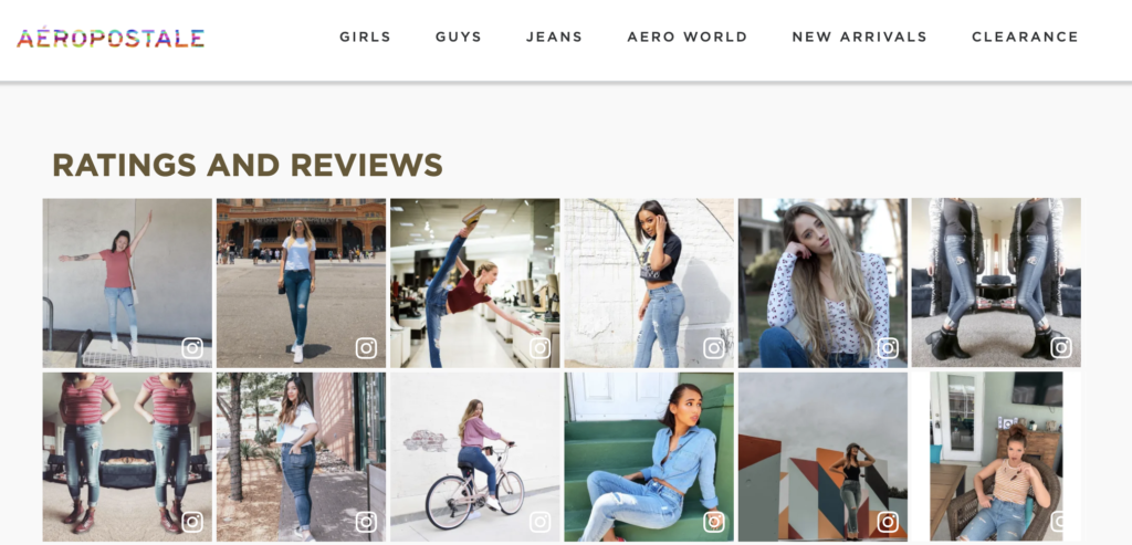
In a UGC context, photos from actual customers of the product “out in the wild”. These show what it looks like in reality
Real-life customer photos trump corporate glossy product images taken in a controlled lighting environment. Why? They are far more authentic and reflective of the actual reality of buying the item in question.
According to surveys, some 88% of shoppers polled want to see authentic product photos and videos. Our tracking data shows that engagement with this user-generated imagery results in an 81% increase in visitor conversion rates.
They say a picture is worth a thousand words; most of us are very visually oriented and images can convey information in a much more nuanced and detailed way than text. (e.g. how a duvet looks in the bedroom, or the specific grey color of a belt etc.).
One brand leveraging user-generated imagery to its advantage is casual apparel and accessory retailer Aéropostale. Its product display page for its Real Denim High Rise Slim & Thick Curvy Jegging features an image carousel with images from reviews and social media channels showing real people in all shapes and sizes modelling and styling the jeans.

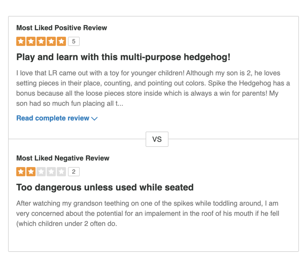
The Review Faceoff showcases the most liked positive and negative review for a specific product.
This review feature gives prospective buyers a read on the most valued product and pros/cons quickly and easily. This reduces effort while promoting authenticity.
While it may seem counterintuitive to showcase a negative review, our research shows 85% of shoppers seek out negative reviews prior to purchase. A full two-thirds of visitors filter for 1-star reviews and yet these visitors still convert at 108% the rate of general web traffic.
After all, no product is perfect and customers are realistic to know that; a jacket is super warm and waterproof, but maybe the zipper breaks easily. Customers want to know the full scoop – all the pics and pans, what people love and what people hate. They’ll want to see the worst and realize to see if they can live with it. And this also mitigates future disappointment down the road because it helps manage expectations
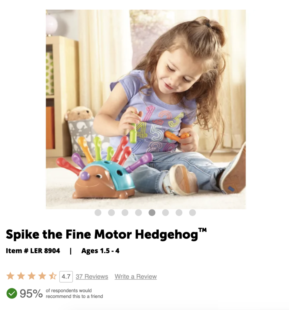
One example of a brand reaping the rewards of the Review Faceoff is Learning Resources. On its Review Snapshot on the Spike the Fine Motor Hedgehog, shoppers can clearly see the pros and cons of the product as cited by reviewers and view the Most Liked Positive Review and the Most Liked Negative Review.
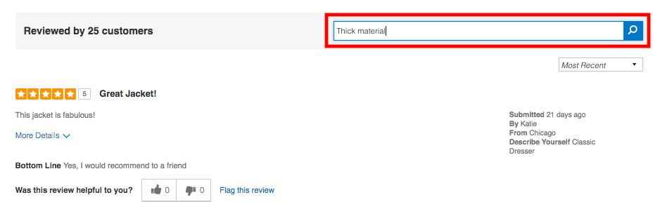
A bar at the top of your review content in your product page that provides the ability for customers to sort and filter your review content. This helps them personalize their own research process to get the information they need on the product before hitting the “buy” button.
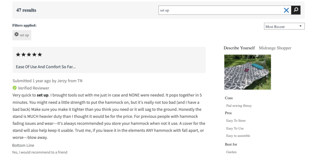
Consumers like options, so giving shoppers the ability to sort and filter and slice and dice UGC as they desire is a big win. By adding Sort and Filter/Search Bar functionality, you can offer the flexibility to sort by reviews with images, highest rated, lowest rated or most recent reviews, a certain size, or other keywords. They get the information they need to make informed purchase decisions.
The Sort and Filter/Search Bar on home furnishing retailer Hayneedle’s product display page for its Algoma 11-ft. Cotton Rope Hammock with Metal Stand Deluxe Set, is a solid example. It’s also clearly a very helpful feature given the product has over 225 reviews!
Do You Have the Data to Drive UGC Decision Making?
While these types of UGC are tried and tested by our customer community and proven to help drive conversions, your results may vary. It’s important to consider what is important to your audience when devising your UGC strategy.
And as with any eCommerce tactic, it’s important to benchmark efforts to determine what is working. Small shifts can produce big results when it comes to UGC, but you need to be able to evaluate the effectiveness of your current efforts to understand what, if anything, needs to change.
Unfortunately, many brands have little to no insight into their UGC efforts and as a result, are unable to size or even define this impact. They have no way of knowing the nature or extent of consumer interactions with UGC. To address this issue, we recently released a new analytics product that provides very precise recommendations based on data (i.e. what interactions with UGC content lead to conversions/purchases).
This new offering enables brands to establish the impact of their UGC investments across their eCommerce environment, including analysis across all UGC on product pages; engagement data, such as viewing of, filtering of and clicking on specific elements on each product page; key related site analytics, such as time on page, and critically subsequent actions and outcomes – i.e. whether shopper bought the product or not.
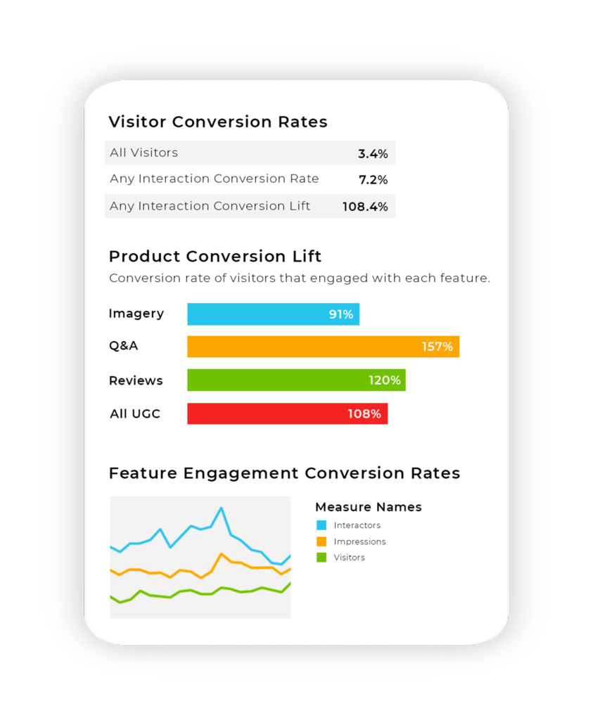
As online shopper behaviors are shifting drastically, now is the time to make sure your product pages are capturing customers’ attention. What type of UGC content results in better outcomes? Understanding which types of UGC will drive the most impact will allow you to prioritize efforts to give your customers more of what they want and need and in turn maximize conversions.
Not sure your review display is giving you the highest conversion rate? If you are a PowerReviews customer, reach out to your Customer Success Manager who will tell you have the right setup in place. If you are not a PowerReviews customer, we’d love to tell you more.


