Effective product page designs are essential to the success of your ecommerce business.
Here’s a fun fact: Statista data predicts by 2020, over 2 billion people worldwide will be purchasing goods and services online.
The numbers are increasing exponentially, up from just 1.5 billion digital shoppers in 2016.
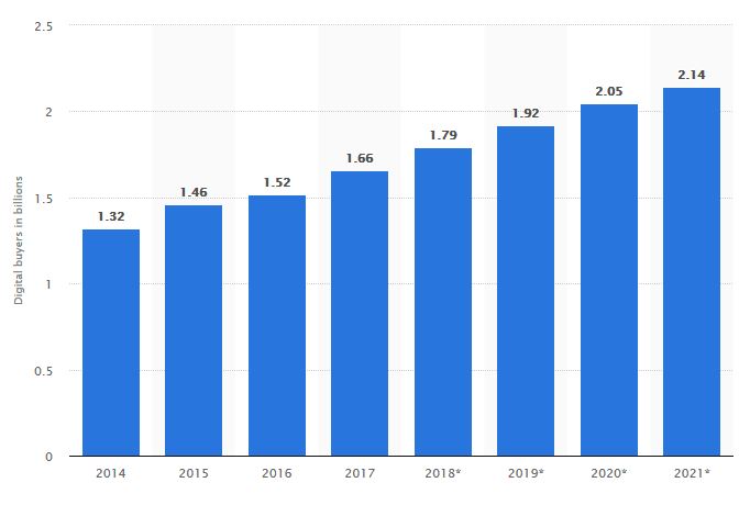 At the same time, this rise in demand has caused an increase in competition, and a decrease in conversion.
In fact, research from Invespcro shows that the average website conversion rate has decreased from 3.4% in 2014 to 2.8% in 2018.
The same study found that product pages have an average effectiveness of 10.4%. In other words, 1 out of every 10 people that visit a product page will add the product to their cart.
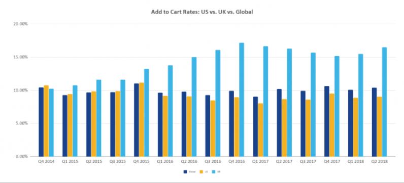
How does your ecommerce website stand up to these online shopping statistics?
If you feel that your product page designs aren’t living up to their potential, you’ve come to the right place.
Ultimately, your product page designs will have a huge impact on your conversion rates. So, let’s make them as effective as possible.
8 Elements Your Product Page Designs Must Have (Including Examples)
There are certain elements that your product page designs must have.
A picture, a description, and product prices are all examples of necessary items your product pages already have.
But you need to go above and beyond if you want to stand out as different.
We’re going to discuss some obvious and some not-so-obvious design elements, and how you can use each of these to make your product pages live up to their potential. Let’s get started!
1. Pictures & Videos That Sell the Story
People love shopping online.
In one study, it was found that the main reason why people shop online is for the convenience of shopping whenever they feel like it.
However, the same study found that more than half of people who prefer to shop in-store do so because they want to see, touch or try on the product before purchasing.
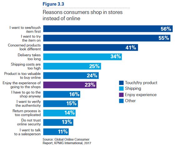
Since people can’t be in physical contact with your products before purchasing, your product page needs to get them as close as possible.
That’s why you need to include clear, up close visuals for your products.
On average, people want to see between 5 to 8 pictures per product. This allows you to give different views of the product and show off important features.
Check out how bag and clothing brand Kaft does this with the images for one of their messenger bags ideal for daily use.
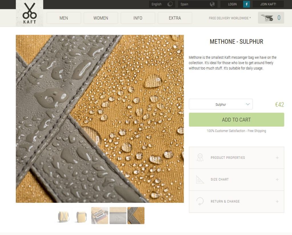
The fact that the bag is water resistant is a very important feature. This picture highlights that feature, and also allows zoom so that users can get a full view.
Another way to make people feel like they’re getting a complete view of your product is by including a video.
Check out how Glossier does this with the video that appears on their Lash Stick page.
By showing real people using their product, Glossier lets users feel like they’ve been able to try the product themselves. This is critical for a driving a moving and authentic feel to the product page design.
2. A True Size & Fit
Especially for apparel brands, it’s important that people feel secure in their purchase. They need to know whether or not this product is going to fit them, without being able to try it on.
To improve conversions on your product page–and significantly limit product returns of wrong size orders–it’s important to include product page designs that clearly show the true fit of your products.
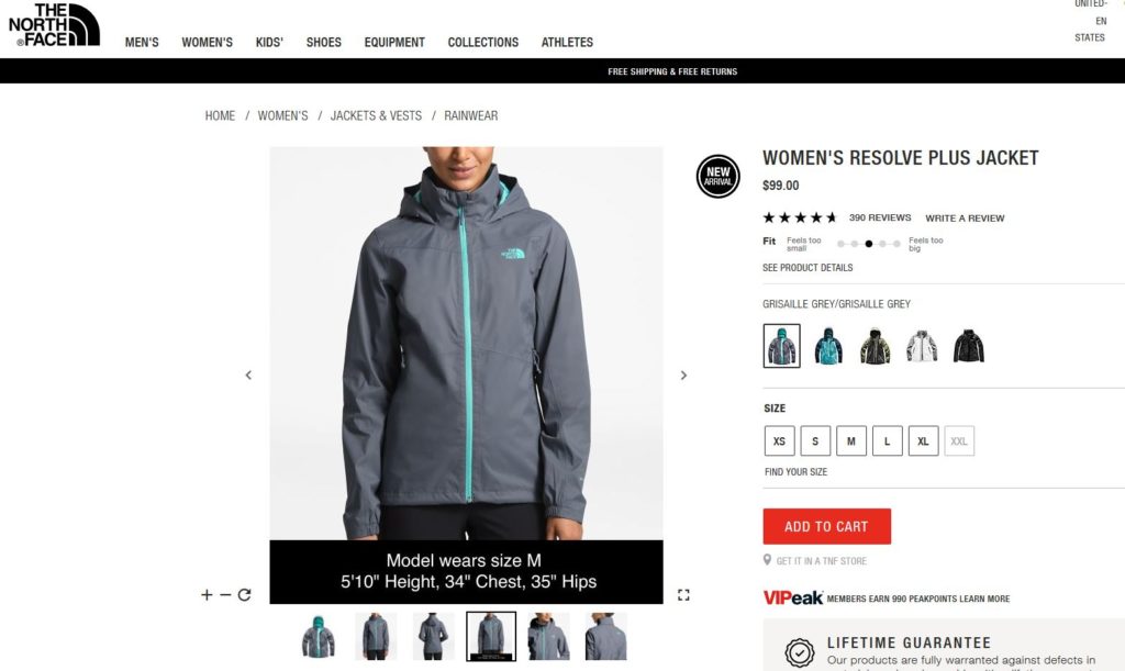
Let’s see three ways that The North Face does this with their product pages.
First, they include the measurements of the model in the pictures and give the size jacket that she’s wearing. It might not seem like much, but it gives the extra details needed when making a purchasing decision.
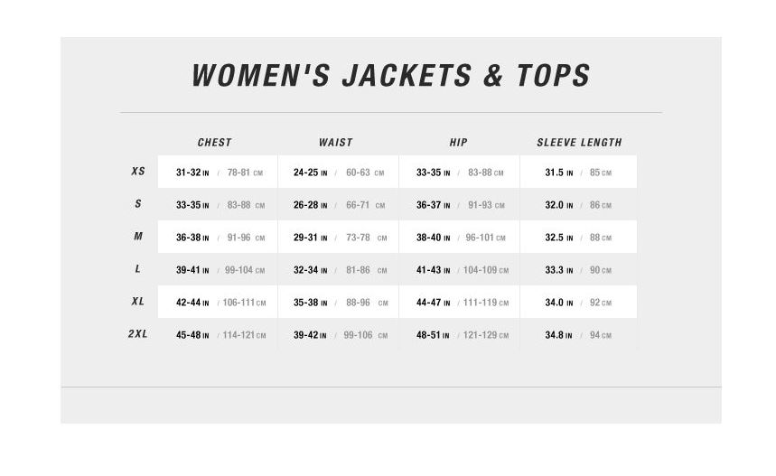
Next, they include a helpful pop up that allows users to find their perfect size for this particular type of product. This chart allows shoppers to pin point exactly the size and fit to nail down the right jacket.
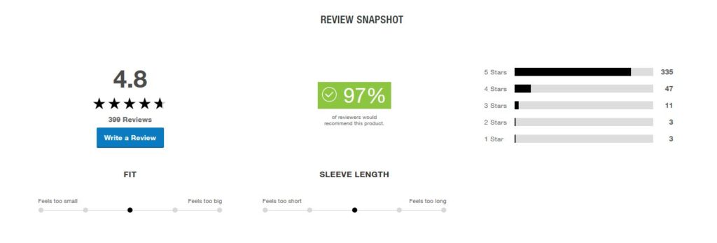
Lastly, as part of their review section, they include other customers’ ratings on the fit and the sleeve length of the jacket. Everyone knows brands all have various sizes and fits, and in apparel, you have to be exact for your online shoppers.
The Review Snapshot from PowerReviews gives customers more confidence in their buying decisions and helps limit the dreaded, costly returns.
By including detailed pictures with the model’s measurements, an accurate sizing chart, and a rating system for fit and feel, you can give your customers the confidence to purchase your products knowing that they’ll fit right the first time.
3. Questions & Answers to Remove Doubts
No matter how good your product descriptions are, people will probably have some questions.
If you find that people are frequently asking the same or similar questions, why not include a Q&A section for your product page designs?
This will help remove any doubts that people have before they purchase. It also makes it easier for people to get answers, since they won’t even have to leave your product page to do so.
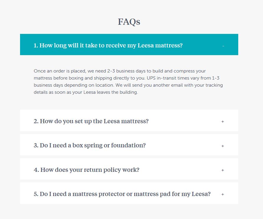
The mattress brand Leesa does this with the FAQ on their product page. Everyone has questions, so why not use your community of shoppers and your own customer service team to provide the answers to purchase-blocking questions?
4. Keyword-Optimized Text
Including keywords in your product page helps users find what they’re looking for quickly, and also helps your product pages rank on search engines. Following the best practices with SEO for ecommerce is essential to get pages to appear in the rankings.
Ideally, you’ll want to aim for long-tail keyword phrases that include various words. For example, instead of Men’s Sneaker, aim for a more specific keyword like Men’s Trail Running Sneaker.
Once you’ve chosen the right keywords, here’s three places you should put them:
- URL: The product page URL should have just your main keyword.
- Title (H1): The name of your product should be optimized to your keywords and your H1 should include it.
- Description: Within your product description, include your main keyword and even try to add related keywords for context.
All this being said, remember not to stuff your product page with keywords. Never add them where they don’t sound right, since this could lead to problems for your website down the road.
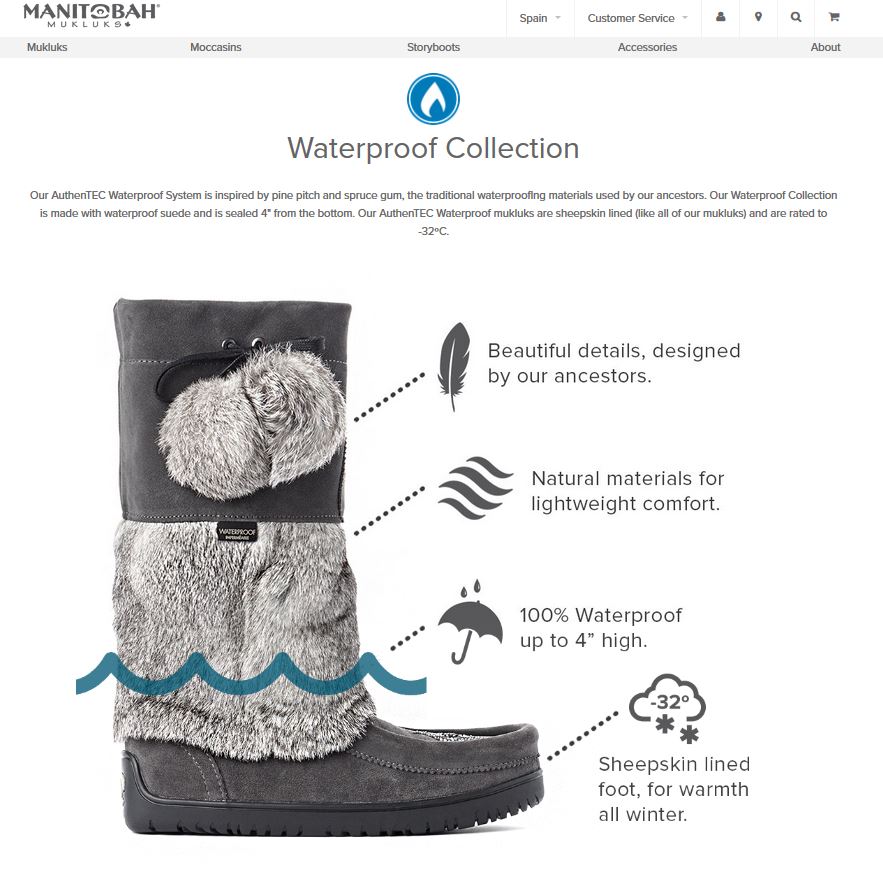
See how shoe brand Manitobah Mukluks uses keywords skillfully through their product description? This helps their brand rank organically and also uses unique content that the search engines look for when ranking products.
5. Navigation Tabs to Keep Your Pages Clean
While it’s important to have the right amount of information on your product pages, it’s just as important that your product page designs remain clean and visually appealing.
In other words, don’t clutter your page with text and buttons.
A great way to remove clutter from your product pages is by using navigation tabs. That way, people can click to open a tab and read more, but the page still stays clean.
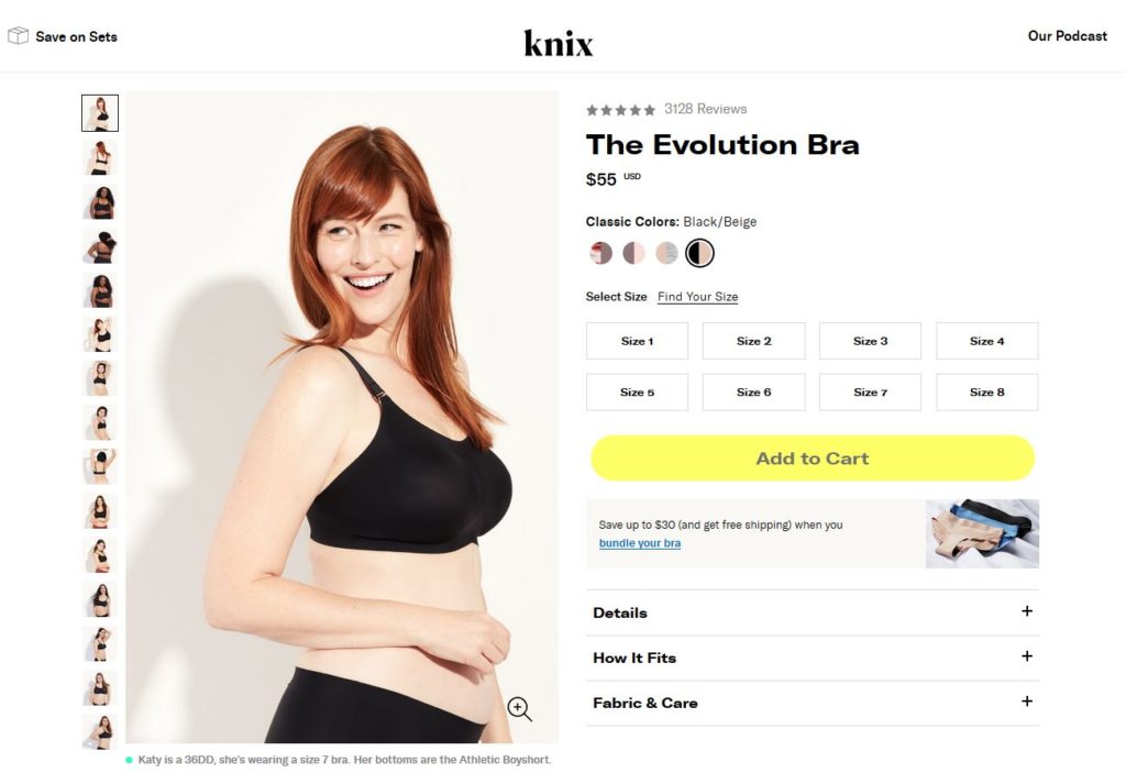
The women’s underwear brand Knix does this with their product pages really well. There’s not a ton of text at arrival that makes it overbearing to read and buy. However, their navigation tabs allow those who want more product information to easily click and find it.
Some of the most important information to include here is the fit, care instructions and even product quality so shoppers know your materials. The best part is the clutter is removed by clean navigation tabs at the bottom right.
6. Clear & Trustworthy Ratings & Reviews
Another essential element of your product page design are authentic ratings and reviews.
These customer reviews need to be displayed prominently in the product page. One retailer doing this well is Zappos, which showcases the reviews clearly at the top.
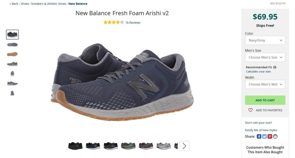
Next, you’ll need to display real reviews that specify what your users are looking for in the product. For example, Zappos takes their reviews and displays the most helpful positive review alongside the most helpful negative review.
We already know that 85% of shoppers specifically seek out negative reviews and even typically don’t trust companies with only 5-star rated products. Here we can see Zappos use their reviews to include separate star ratings for comfort and style.
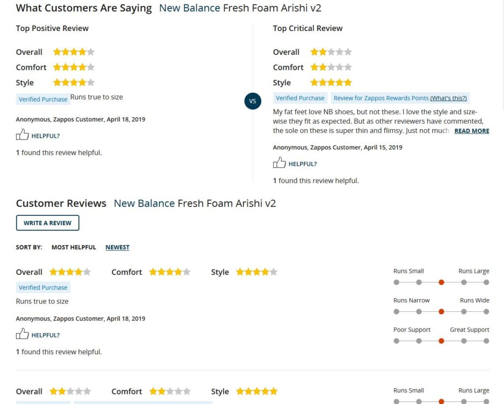
Since shoppers specifically seek out negative reviews, take a lesson from Zappos and display both sides. This actually helps build buyer confidence in your reviews and avoids the “too perfect” product review, which always comes off inauthentic.
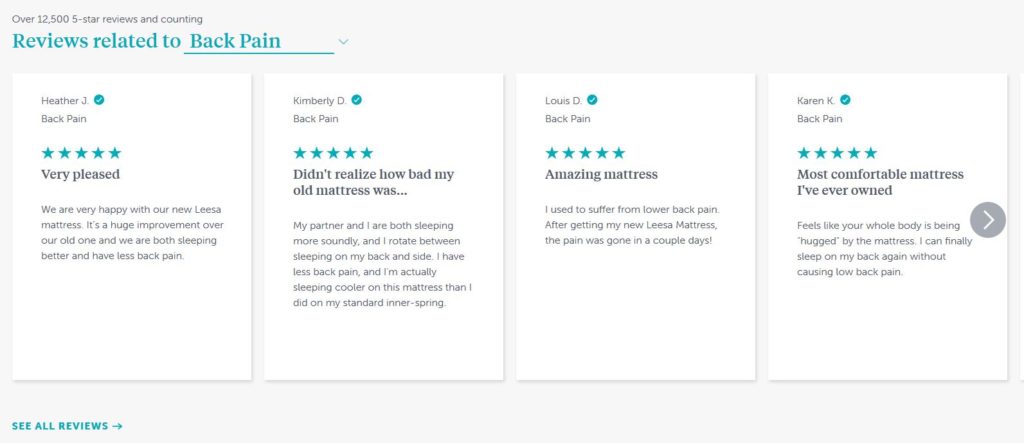
Another way to take your reviews one step further is to organize them by topic, like Leesa does in their reviews. This helps people find exactly what they need and right away.
7. User-Generated Visuals for Ultimate Social Proof
While displaying reviews is a great way to build trust in your products (and improve your product page conversion rate), including pictures and videos from real users has an even bigger impact.
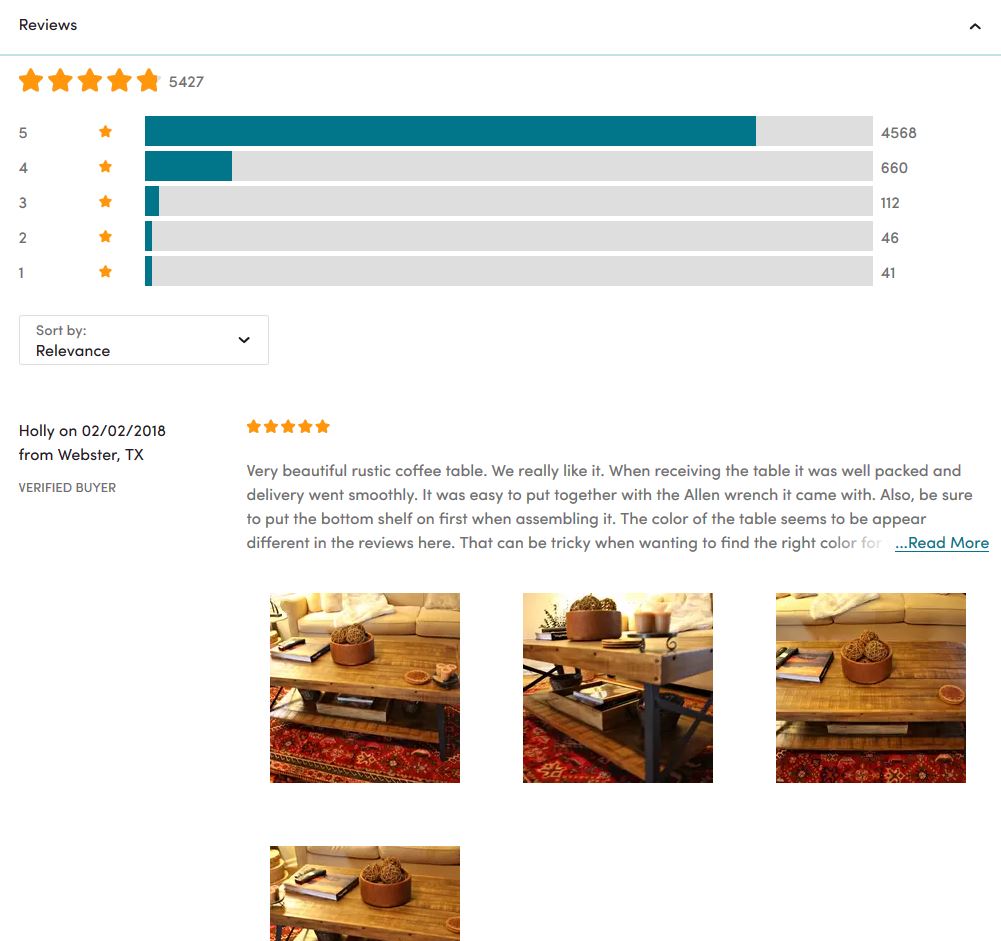
In fact, 88% of online shoppers specifically look for visuals submitted by fellow users. The result? After finding user-submitted photos and videos, 65% of shoppers will be more likely to trust in the product.
Check out how furniture brand Wayfair does this by featuring reviews that include real-life user-generated content to drive trust and authenticity in their product page designs.
Need help collecting more visuals for your reviews? PowerReviews’ Visual and Social Suite allows you to add a content gallery of real-life visuals posted by your users either on your website or on social media.
This collection ability could collected by encouraging a branded hashtag to use for your products on social or even by running a product sampling campaign. Whatever your needs, PowerReviews can help–big or small.
Get in touch with our team today to learn about the power of user-generated content on your product pages!
8. Product Suggestions
So, why are product suggestions considered an essential product page design element?
It’s not just because everyone else is doing it.
Product suggestions help you increase the total amount spent per purchase by giving people great ideas for what to buy. But they also help move shoppers along with the product they’re already looking at to encourage the buy.
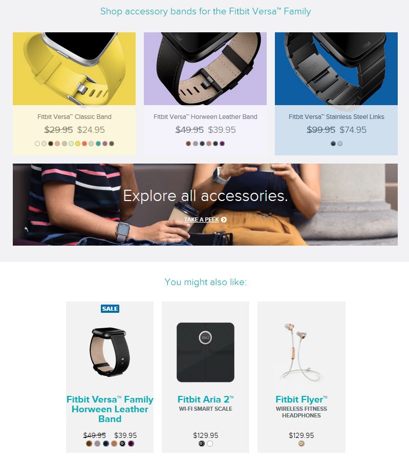
Fitbit skillfully includes suggestions in the product page design and is a great example of how to get buyers to add more to the cart. When looking at the product page for the Fitbit Versa, you’ll find suggestions for accessories towards the end of the page.
This is useful to the customer, since not everyone likes the band that the Fitbit comes with and will be eager to spice things up with a new band.
Then, below the recommended accessories, there is a “You might also like:” section, which includes products that can be used in conjunction with the original product.
You can do the same by pairing products that work well together, or by including items that are frequently purchased together on the same product page.
May the Best Product Page Designs Win
Ecommerce is a growing world, and you’re a part of it. If you ace the design on your product pages, constantly adapt to new customer needs and put value on authenticity, you’ll be able to take an even bigger piece of the pie home.
While people love the convenience of shopping online, they also see the disadvantages. That’s why you need to make your online shopping experience just as good (if not better) than shopping in store.
To that end, apply to above tips to create truly fantastic product page designs that capture people’s attention, give them the information they need without overwhelming them and help them put real trust in your products.
Then, your product page design will live up to its full potential.


