As ecommerce spending explodes year-over-year, it’s clear that consumers today aren’t shy about buying from new brands online. And for those same consumers, the path to purchase is paved with visual content.
Heck, just do a quick Google search and see for yourself. What will you find?
Product photos.
Brand logos.
Star ratings and reviews.
Video thumbnails.
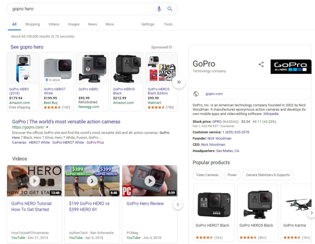
Visual content is front-and-center in today’s search results before users even have time to think about sifting through a laundry list of links. That’s because seeing is believing.
Brands need to operate under the principle of “show, don’t tell” if they want to convert modern customers. Perhaps this is why creating and curating visual content remains a top priority for businesses in 2019.
The good news? Harnessing the power of visual content doesn’t require you to be a creative genius. In this guide, we’ll break down the fine details of visual content in the path to purchase. You’ll see firsthand the specific visual strategies top brands are using to convert customers and how to roll them out yourself.
With that, let’s dive right in.
What is the Path to Purchase?
The path to purchase represents the various channels that business rely on to transform leads and prospects into customers. From search engines and social media to email and paid ads, there is no “right” channel for converting customers.
Likewise, there is no single path to purchase in the customer journey. Visual content plays a vital role in the path to purchase for a couple of key reasons. For starters, visual content is easy to digest at a glance.
A video or image can show off a product in action in a fraction of the time that a blog post or lengthy email. This spells good news for appealing to today’s customers and their microscopic attention spans.
Consider also that people typically retain and recall visuals much better than the written word. Consumers today are hit with more marketing messages on a day-to-day basis than we can count. The more often someone sees your brand’s imagery including product photos and logos, the more likely you are to stand out over time.
Think about the marketing rule of seven that states people need to see what you’re offering at least seven times before they’re ready to buy. Paving your path to purchase with visual content means creating meaningful, memorable touch points that’ll result in sales.
And if nothing else, Brandwagon Digital Media wants you to bear in mind businesses boasting unique visuals see conversion rates seven times higher than those that don’t.
What Does a Visual Path to Purchase Look Like in Action?
We’re glad you asked!
Let’s look at a real-world example of how visual content can impact the path to purchase. For example, say you’re taking a Disney vacation with your family and you’ve been tasked with one of life’s greatest challenges: picking a spot for dinner.
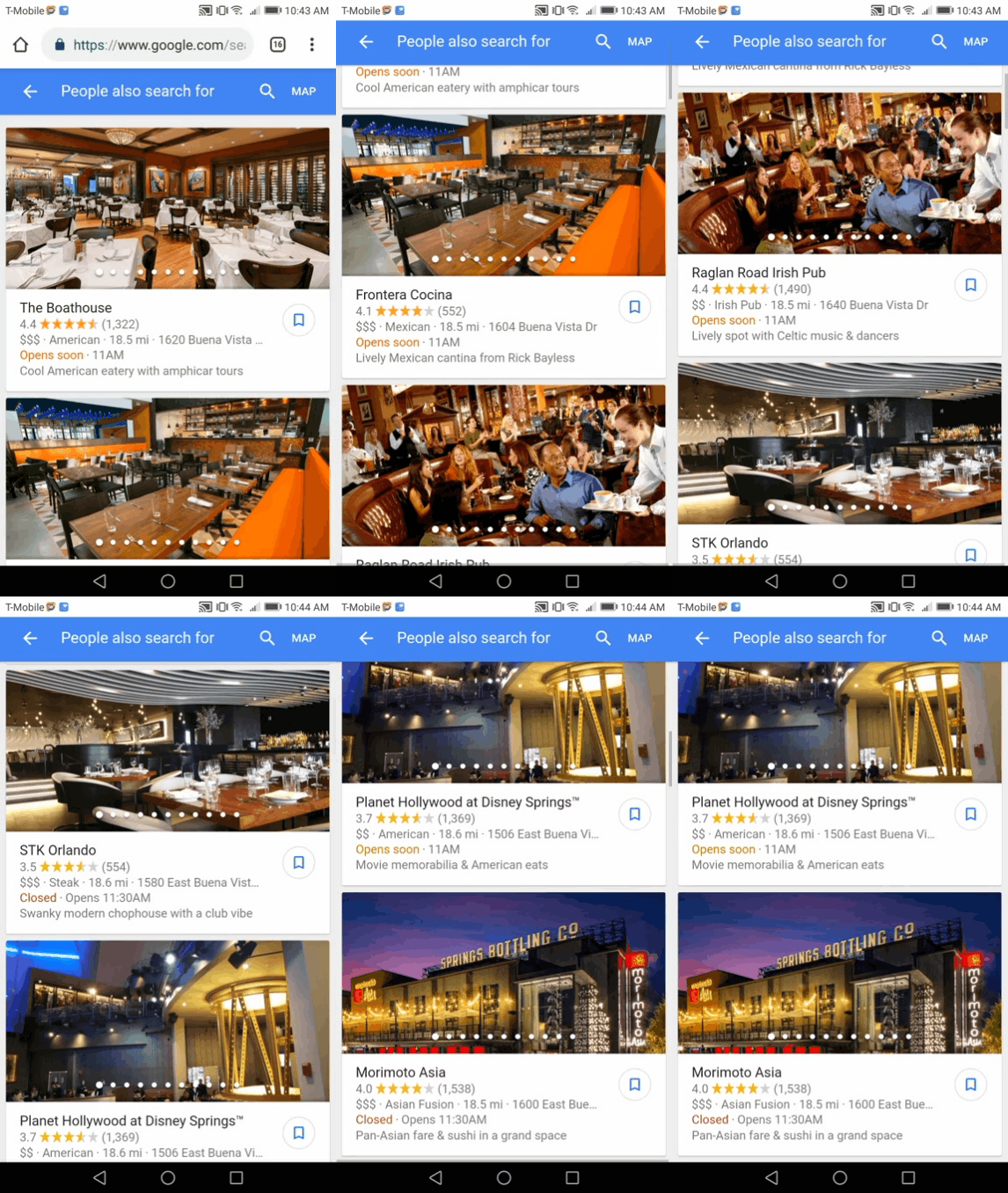
More than likely, you’ll start with a simple Google query–and in this case, you’d likely search “places to eat at Disney Springs.” While you’re obviously spoiled for choice, the Google ratings and restaurant snapshots help you narrow down your decision.
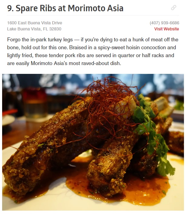
As part of your journey through Google results, you find some listicles like this one that shows off pictures of the author’s favorite fare.
Or ever better, you come across a video or two that breaks down the best restaurants in the area.
Based on your research, you pick out a spot with some confidence. Scrolling through customer photos, you see your potential menu firsthand and get a better idea of the restaurant’s vibe. Customer reviews then clue you on what you should expect and which menu items to check out (or avoid).

And if you’re socially savvy, you might even take to social media to which local spots have customers buzzing in real time.
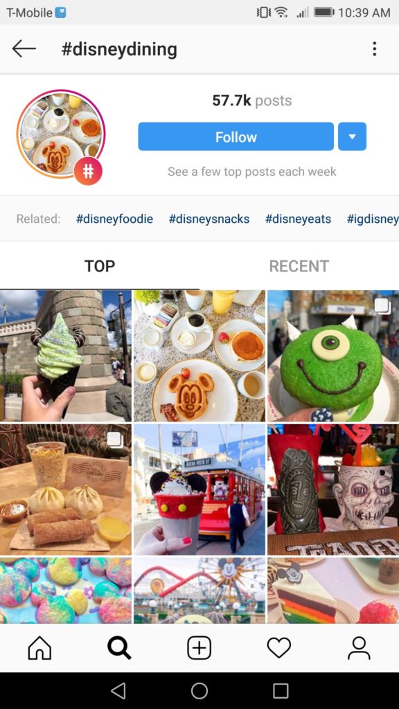
See how that works?
We often hear the notion that effective selling online is all about creating a good customer experience. Through visual content, and especially through user-generated content, businesses create authentic experiences that eventually convert customers. This is just a snapshot of all the various avenues to make those experiences happen.
This is why we created Journey IQ, a completely scalable tool to provide you insights into what happens online and in store. This tools helps incentivize buyers who already love you to go on special missions to help you improve sales and understand the complete shopping experience.

And on a related note, remember that the path to purchase isn’t a straight line. Any combination of these channels are fair game both before and after purchasing (specifically sharing hashtags or leaving reviews).
How to Pave Your Own Path to Purchase via Visual Content
No two paths of purchase are the same for two different businesses. And hey, that’s a good thing.
This gives your business a much-needed sense of freedom when it comes to the types of visual content necessary to make those meaningful touch points. Below are some tips for brands looking to to put their visual content on display regardless of your industry or budget:
Make Sure Your Product Pages Pack a Punch
Product pages are a prime place to step up your visual game. Chances are you couple each of your product listings with some form of imagery, right?
But why stop there?
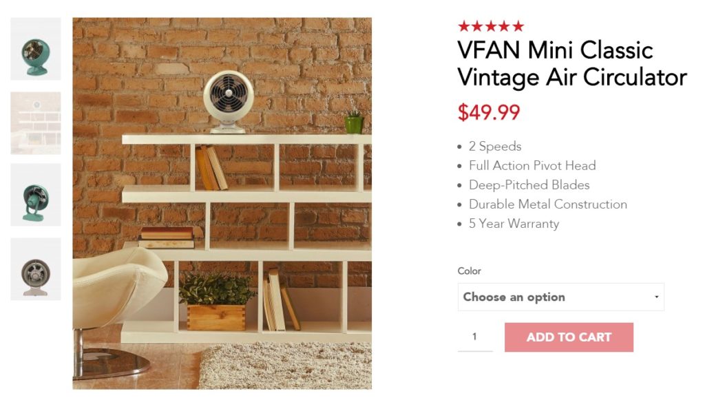
Vornado includes some still photos as well as action shots of their products to help shoppers visualize them in-person. Additionally, Vornado integrates ratings and reviews to build trust with shoppers.
The star-ratings themselves work to catch the eye of potential buyers, encouraging them to spend longer on the page and eventually make a purchase. Given that Northwestern University data shows 95% of shoppers read online reviews before buying, providing a place for buyers to sound-off is a no-brainer.

Star ratings and customer photos provide shoppers an authentic look at a product while also making the page more aesthetically pleasing. In fact, the PowerReviews Growing Power of Reviews report found 63% of shoppers look for user-generated content and visuals from real customers before making a purchase.
So why not put your biggest fans’ visual content front and center on your product pages? Well, you can do just that with the PowerReviews Visual and Social Suite.
We provide more avenues to collect and display user-generated content directly from your customers and their social channels. Whether your customers share an image from their phone or social media channel like Instagram, we provide the integration tools to make this easy on brands and retailers, but a quick and painless experience for your shoppers.
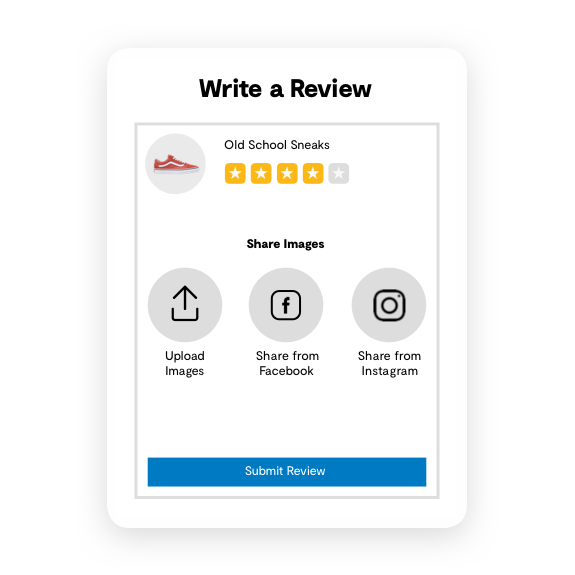
But what if your customers aren’t uploading visual content for your products? It’s not easy asking for content, but there’s definitely a great place to start looking.
Curate High-Converting Imagery from Social Media
To say that social media is a staple of the path to purchase would be a massive understatement.
Here’s some food for thought: over half of millennial consumers research products via social. Meanwhile, a staggering 85% of Gen Z customers are doing the same.
The beauty of user-generated content is that it’s, well, user-generated. Rather than worry about coming up with new imagery, you simply let your customers do the legwork for you.
Of course, that involves encouraging those customers to start creatin’.

The first step to making that happen is by asking. For example, brands like Ulta encourage fans to use the hashtag #UltaBeauty for a chance to be featured on their feed.
This results in a slew of new content for that’s a far cry from a typical product photo. Hashtags and opportunities to create user-generated content are smart ways to encourage more engagement from your customers.
https://www.instagram.com/p/BsWmfV6gP3r/
User-generated content is likewise great marketing firepower for your website or email list. For example, Ulta features its user-generated photos on-site in the form of a lookbook. Many brands likewise feature similar photos in their email campaigns to encourage more social shoppers.

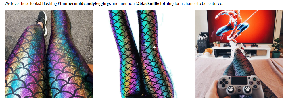
And to bring the power of user-generated content full-circle with our first tip, customer photos are fantastic for product pages. Brands like Black Milk Clothing promote item-specific hashtags to share for individual products. This is yet another opportunity to build trust and convert buyers through visual content.
Reel Customers in via Video Marketing
We can’t talk about visual content without talking about video.
As you might already know, video content is taking over the internet itself as the majority of all web traffic will be video-based in the coming years. To drive this point home, YouTube is now second only to Google in terms of today’s most-visited websites (recently passing Facebook).
And speaking o Facebook, video is often cited as the most popular type of content across the major social media platforms.
The specifics of why video works so well to reel in customers is no surprise.
Easy to digest? Check.
More entertaining than a traditional blog post or listicle? Most of the time, yes.
But most importantly, videos quite literally show off your products in action. There’s a reason why unboxings and video reviews are so popular: they’re unfiltered, and well, real.
From raising awareness to serving as an ad itself, video is a powerful medium on the path to purchase. For example, BeardBrand regularly publishes tutorials and how-to’s which subtly highlight their own products.
GoPro might be the best example of a brand killing it with video, mostly due to the fact that they’re, you know, a camera company that has heavily invested in action sports. Their eye-popping clips and user-generated content quite literally show what their products can do.
https://www.instagram.com/p/BteXYiXHuEV/
Some brands might shy away from video because they think they lack the budget or production value. That said, not everything you produce needs to be a mind-blowing production.
Brands like Blue Apron put together simple, 15-second clips to feature through their website and social media to give a glimpse of what they have to offer.
And with that, we wrap up our guide!
Learn From What Your Customers Are Already Telling You
It might not surprise you, but there’s a lot to learn from your previous customers. And to take it one step further, there’s even more to learn from the review content they provide on your products.
Try to find the commonalities with your products and how consumers truly feel about them. What this means is brands have to pay attention to small details that might be causing some concern on a product.
For example, if a few customers are having problems with the zipper on your new coat–it might be time to take these product insights to the manufacturer. The only problem is you might have hundreds of products and even more reviews.
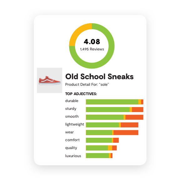
That’s why we created Product Pulse in our Intelligence Suite–so brands and retailers can find, analyze and uncover real product insights within review content. The hours it would take your team to review every single rating would take far too much time–and good luck finding someone to dig through the mess to find insights.
Instead, we do the heavy lifting and analyze sentiment through common adjectives and review analysis from more than 40 million consumer reviews already put through our Intelligence Engine. Your consumers are talking about your products and providing feedback, it’s just a matter if you’re listening to everything they’re saying.
Is Visual Content Part of Your Path to Purchase?
The final takeaway here is that visual content in any shape or form is integral to the path to purchase. Not just because it helps catch the eye of customers but because it builds the trust that results in conversions.
By supplementing your path to purchase with visual experiences for customers, you win more sales.
We want to hear from you, though. Which types of visual content do you find most compelling? Let us know on Twitter!
If you’re looking for a trusted partner to take your visual content to the next level, request a demo of PowerReviews today to see how we can integrate user-generated content onto your product pages.

