97% of consumers consult reviews before making a purchase. Simply adding one review to a product page that previously had none lifts sales for that product by 65%. Consumers who interact with reviews are 115% more likely to convert, and the more reviews you have, the higher your conversion rates.
Clearly, reviews have a huge impact on conversions. The data tells us this.
The problem is, too many brands — however unintentionally — delay adding reviews to their site. Conversations become hyper-focused on making the review display “on brand,” forcing developers through endless rounds of deployment to simply adjust a font size here, or change the shade of a star color there.
Worse, in an effort to be a thought leader, some brands try and reinvent the wheel. They start asking questions like, “Should we use our brand icon instead of stars? That could help us stand out.” (The answer, by the way, is absolutely not. You’ll only confuse your customers, which leaves you with less reviews, and less conversions.)
We’re writing this article to stop this fearsome scenario from happening to you. The research shows that the presence of high quality reviews in large volumes — not some vanity feature — is the largest determining factor in driving page traffic and conversions.
Why? It’s the information contained within the reviews that is the key, not how that information is presented. As a brand, your goal is to provide attention-short shoppers with the confidence to buy from you. So focus on what’s important.
Over the years, we’ve collected data from hundreds of brands, and thousands of end-customers, to analyze what really drives conversions. From the data, we can clearly see what works, what doesn’t, and what really matters when it comes to displaying reviews.
It’s not worth obsessing over the branding of your review display to the extent that you lose sight of what you’re doing. Your goal is to generate conversions. Focus on the best practices we share below — all proven by our data to actually drive more conversions — and you’ll be way ahead of the game.
Review Display Best Practices: The Official Checklist
What makes a top-performing review display? There are some elements that are more important for certain industries over others. For example, an apparel retailer needs to add size and fit to their review display, but that wouldn’t be applicable for a food and beverage brand.
It all comes back to focusing on providing the information shoppers look for and building credibility fast.
In general, however, we’ve honed in on a set of best practices that work well for nearly everybody. When adding reviews to your site, these are the 7 elements we typically recommend to include in your review display.
Other options tend to be unnecessary luxuries that won’t move the needle when it comes to converting shoppers.
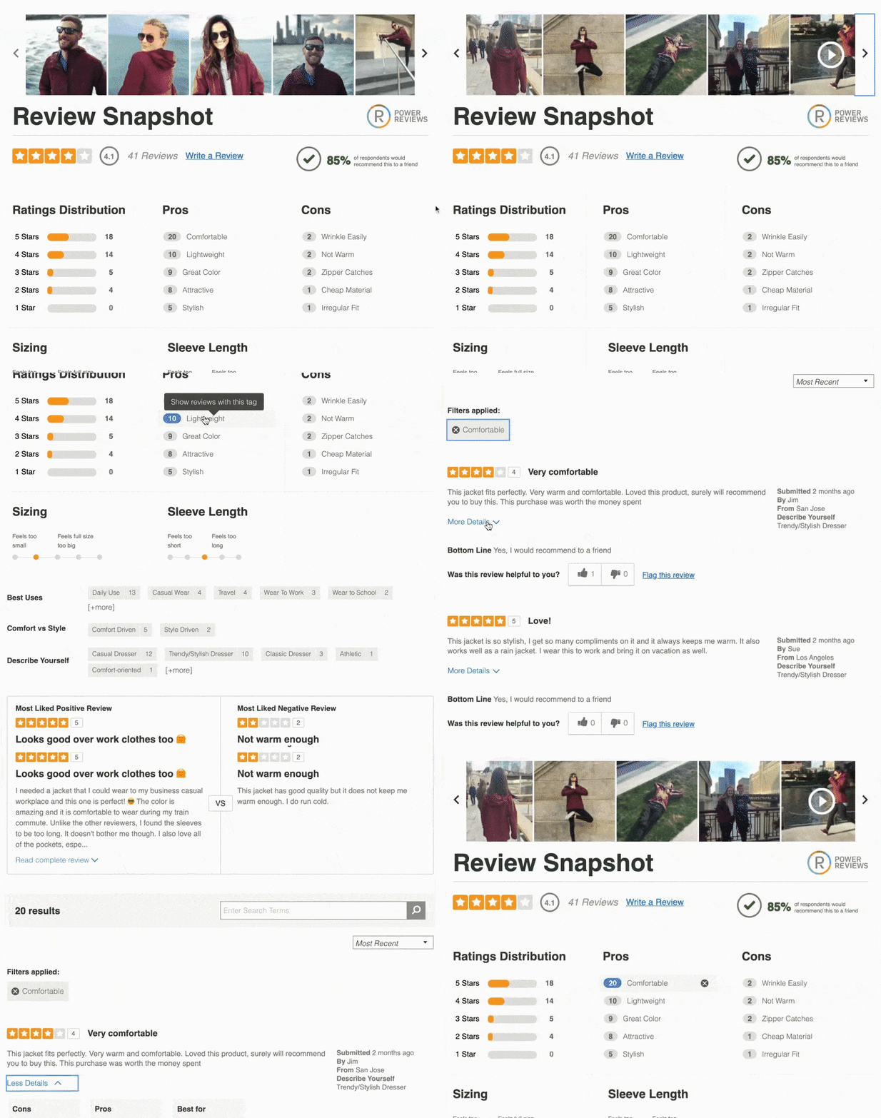
This is a simple visualization of a product’s review rating and volume that sits at the top of the product page, above the fold.
Further down the page, the complete review display includes a visual overview of the review content for a given product, including average star rating and rating distribution.
This functionality helps shoppers find content relevant to their needs. They may click on pre-set filters or search for a specific phrase to find reviews or Q&A content that is most relevant to them.
These help shoppers find relatable content from someone with similar characteristics and use cases to themselves.
These badges build trust, by communicating to shoppers that a review was written by someone who actually purchased the product.
These photos and videos from your shoppers can be collected both natively and through social media.
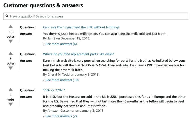
Customer questions displayed alongside the appropriate (and accurate) answers.
Now, the specific order in which these appear, or even the content (in the case of demographic information, for example) may vary from brand to brand. Here are a few review snapshots that show how brands from different verticals implement their review display:
Make it on-brand, but don’t overthink it
We know, we know: we said don’t obsess over your review display. And we still stand by that.. You don’t want to eat up all of your developers’ time on customizing every bit of your review display. The more stylistic changes you make, the longer it takes them to launch reviews — and the longer you go without reviews on your site, the longer you’re missing out on sales.
We’re not saying that brand isn’t important. It is. But, a few, very minor changes can take your review display from generic to on-brand. At PowerReviews, our out-of-the-box solution is designed to be flexible enough to meet 99% of a client’s requirements for review display. When integrating our solution, we recommend making CSS changes to the font style, star color, and background color. These are all pretty simple and quick, and go a long way toward making it feel on-brand.
Still not convinced that a generic review display can really work? Look up your favorite product on Amazon and check out the reviews. You’ll see Amazon uses the regular orange stars with their brand font, and there’s some drop shadowing here and there.
Amazon has tons of money and engineers, but they’re not spending those resources on CSS and branding their review display. They’re focused on review volume and getting the most pertinent information to their customers. Be like Amazon.
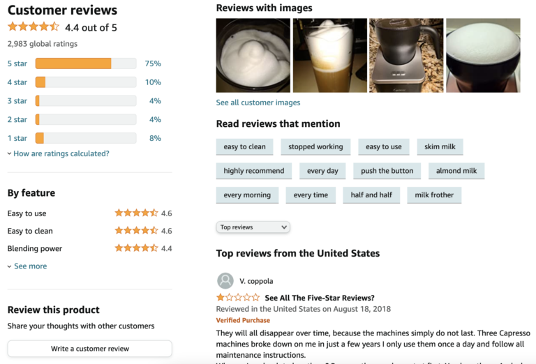
Display Q&A first
This is another thing that Amazon gets right — and many brands don’t. Amazon shows Q&A content above their reviews.
The data favors Amazon. Q&A Content has a higher conversion rate than reviews and images. Customers who interact with user-generated Q&A content are 153% more likely to convert, and products enjoy a 600% sales lift when a customer’s question is answered via Q&A.
Think about it: People are not going to ask a question about a product they’re not interested in. If they’re interested and there’s just one outstanding question keeping them from buying, a quick informed answer from your brand can really help them convert.
Still, many marketers have been conditioned to focus on reviews and reviews alone. Don’t be like those marketers. Position Q&A content above your reviews, and you’re likely to enjoy more conversions as a result.
Help customers find reviewers like them
Reviews are not one size fits all. Your shoppers care most about the reviews that come from shoppers like them, who share their style, use case, and unique situation. That’s why it’s important to give shoppers the ability to filter for reviews from people like themselves. When demographic filters are available, 47% of consumers will use them to seek out information most directly relevant to them.
Even better, we’ve found adding demographic filters translates to more sales. Our clients see an average 52% increase in conversion when consumers interact with filter tags (e.g. sort reviews from users with a particular hair color).
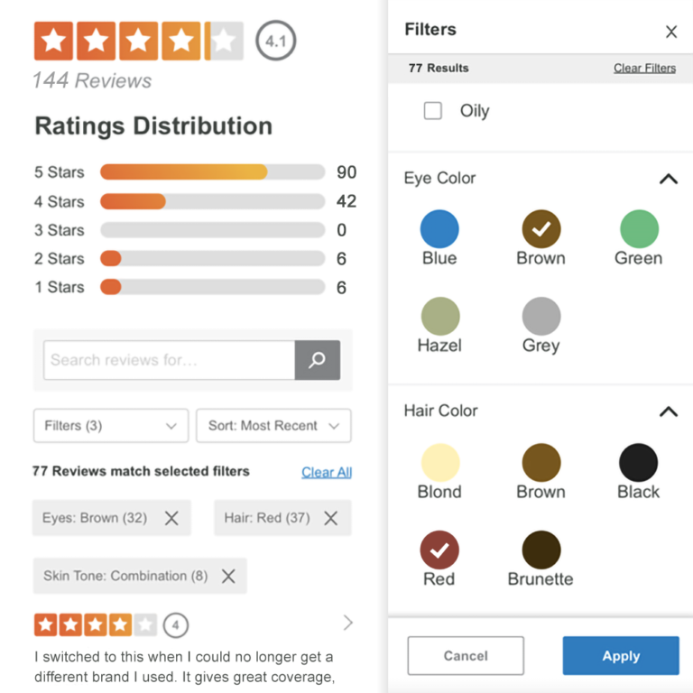
More importantly, this demographic information increases buyer confidence and makes your brand feel relatable — because shoppers recognize people like them among your customer base.
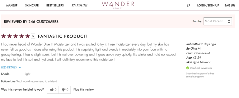
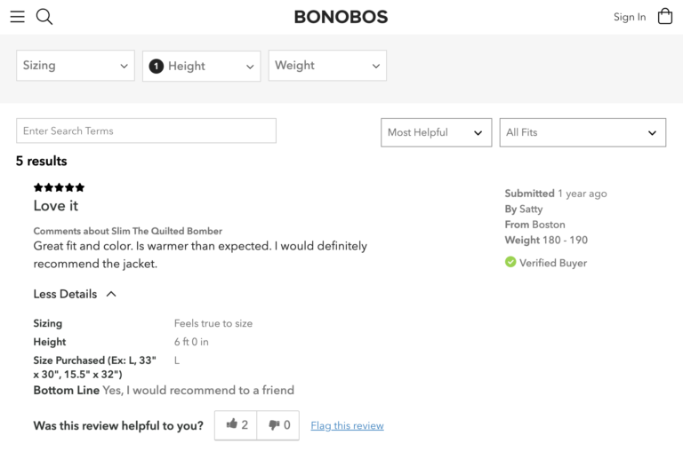
The demographic questions you choose can vary based on your industry. For example, Wander Beauty asks age, location, and skin type, while Bonobos asks about size, height, and weight.
Add an image carousel
People no longer trust the image carousels shown at the top of a product page, full of perfect stock images carefully chosen by the brand. Instead, they want to see real products in real life, from a person like them.
Some brands shy away from user-generated images, but again, we encourage you to look at the data. User-generated images build trust, traffic, and most importantly, sales.
- 88% of consumers specifically look for photos and videos submitted by other consumers prior to moving forward with a purchase decision.
- 72% of shoppers say they’re more likely to buy a product that has reviews with photos and videos in addition to written text, and 40% of Centennials won’t even consider purchasing a product if it has no photos.
- Adding user-generated images to a product page results in an 18% uplift in daily traffic.
- Adding just one customer-generated image to a product page boosts conversions by 69%.
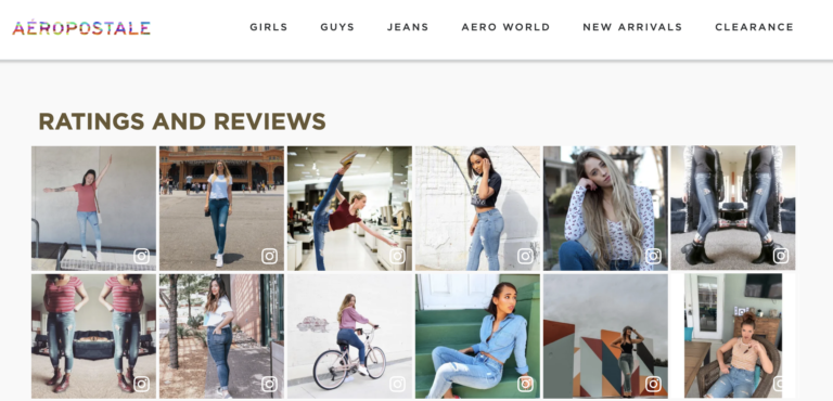
It’s important to display user-generated images in very prominent places. You can collect this content natively. We also recommend pulling in content from Instagram because the content quality is usually higher than what people add to a native review form where no one else sees it. People view their Instagram accounts like a personal brand, so the images they upload are carefully curated — and more likely to align with your brand standards.
Images are almost always a good idea, but again, there are exceptions to every rule. Images are essential for makeup and apparel, but for credit cards, they’re not necessary.
Don’t shy away from negative reviews
When implementing a review display for our clients, the #1 question we get is about one-star reviews. Understandably, brands worry about bad reviews scaring customers away.The thing is, negative reviews actually help your brand. 82% of consumers specifically seek out negative reviews. Our data shows the top three things people interact with in a review display are all related to negative reviews (i.e. sorting by 1-star reviews, filtering the most helpful negative review, and searching for the most negative reviews).
Of the shoppers who click on star ratings, 63% click on the 1-star option. Moreover, those shoppers are more than twice as likely to convert than shoppers that don’t click on anything (7.8% conversion for 1-star filter clickers vs 3.7% conversion for non-clickers).
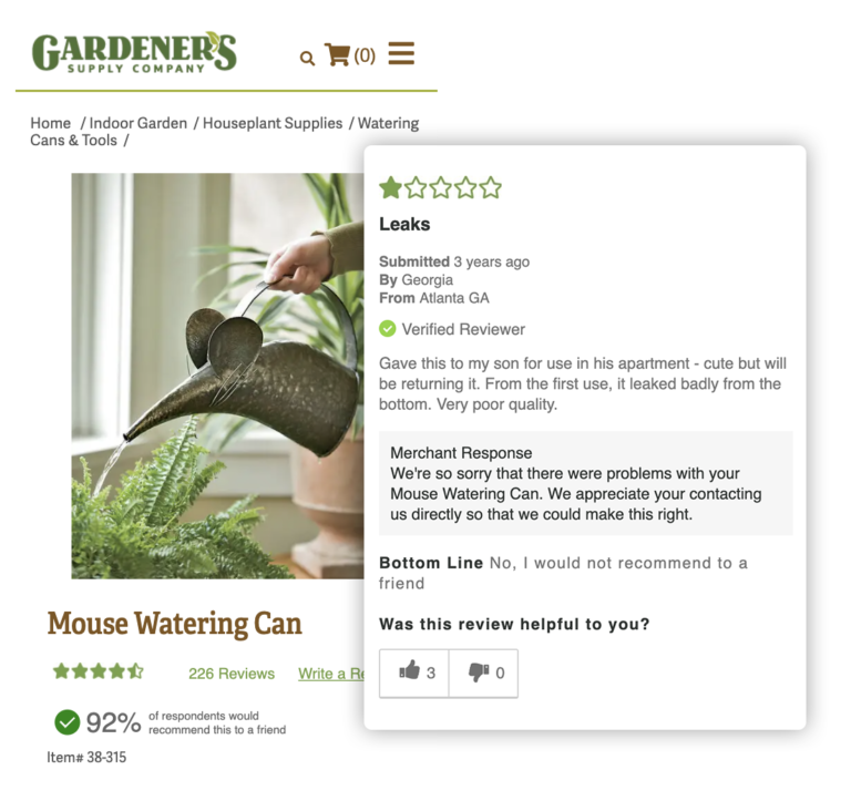
Shoppers want to confirm use cases and biases they might have about a product, and one way to do that quickly is to see what the unhappy people said about it. They use that negative content to inform their purchasing decisions, and remove barriers and hesitations they might have had previously.
The takeaway: Don’t be afraid of negative reviews. Trust that most customers can connect the dots. If the negative review is from someone with a completely different use case than themselves — such as a grandma buying a tricycle as a gift vs. an experienced dad who’s bought several tricycles before — it’s not going to affect their behavior. Rather, it can be an opportunity for you to win customers over and validate your brand. Show them that you are listening and responding to customers.

Get Started Now
We saved the easiest, and perhaps the most obvious, tip for last. The best thing you can do for your review display is to launch it as quickly as you can (assuming everything’s been QAed, of course). Consider the brand experience, and use the best practices as your guide, but don’t lose sight of what’s important: conversions conversions conversions.
When implementing your review display, use common sense and be thoughtful. Think about what’s going to have the biggest impact on shopper behavior, and prioritize that. Everything else can wait. You can always make improvements later, once you have more data to inform your decisions. Get more tips for success in our Complete Guide to Ratings & Reviews for 2021.


