There are a ton of unique ecommerce companies that make up the online shopping ecosystem. From custom embroidered shoes to rare board games, it seems like there’s a market for just about every niche.
But what’s one issue all ecommerce brands and retailers have in common? Cart abandonment rates.
A study from Baymard found only 1 in 4 customers complete a purchase. This means the average cart abandonment rate is roughly 68%. That’s a lot of cold feet.
Here’s the good news–solving cart abandonment isn’t rocket science. But to know how to stop cart abandonment, you need to fully understand why it occurs in the first place.
What Is Cart Abandonment & Why Shoppers Leave
Cart abandonment is the consumer process of digitally adding an item(s) to an online cart and leaving the website without ever paying or finalizing the order. But the reason shoppers leave isn’t just due to indecisiveness.
According to Statista, 56% of shoppers left their carts due to unexpected costs, like additional shipping or taxes. What’s more, 36% of customers left after finding a better deal by comparing prices and 25% said it was due to a poor navigation experience.
The list doesn’t stop there. Consumers have several several reasons they close their tab before making a purchase. But these reasons are all saying the same thing–companies must make customers feel secure, empowered and confident about their purchase.
So how can brands do that? Let’s take a look at 16 ways you can effectively limit cart abandonment on your ecommerce site:
1. Eliminate Cost Surprises at Checkout
There’s no better way to scare customers away than adding surprise shipping costs or extra fees at checkout. One of the top reasons why customers abandon their carts is due to unexpected costs, so why not be as transparent as possible from the get-go? Limit cart abandonment by being honest with much customers can expect to pay before they click “order.”
So what’s the best way to approach this?
Shipping calculators are great to immediately show how much customers can expect to pay for shipping and other associated fees. Depending on your ecommerce store builder, adding a shipping calculator to your product pages early in the checkout process gives information on fees up front.

Price calculators work well at showing fees the second an address is included like this example of one installed on a WooBox storefront. Some ecommerce site builders, like Shopify, have shipping calculators built right into store themes to make things super easy.

Others, like Square Space, allow you to enable shipping calculator features within the settings of your storefront to limit any confusion with your customers. The bottom line is to be crystal clear with any additional fees associated with your product to avoid scaring away customers.
2. Include Thumbnail Images of Products in the Checkout Window
It’s not likely customers forget what’s in their shopping cart—unless they’ve gone on a massive shopping spree—but why not make it easier to remember? Having a visual reminder of their items in the cart serves as a way to reaffirm what they’re going to buy.
This checkout page from Madewell is an excellent example of leveraging thumbnails in the checkout window. The customer easily sees each item and other relevant details like color, size and quantity.
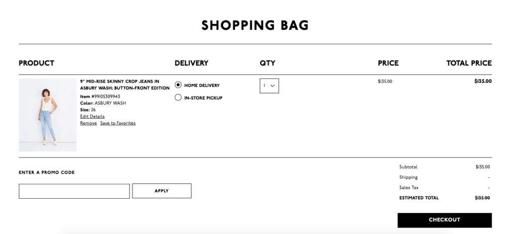
Shoppers can check that the right items are in the cart, which also allows them to easily review products visually. This might make the difference between a customer solely focusing on a large cart total vs. a long list of awesome products they’re going to get.
3. Highlight Customer Savings in Real Time
A great way to encourage customers to convert is to show them how much they are saving while shopping. Whether it’s from a sale, promo code or discount from a VIP program, shoppers love to see what they’re saving.
This checkout window from the women’s athletic clothing line, Fabletics, does a great job of showing savings in real time. Customers see the regular price of the item as well as the price they pay as a VIP member.
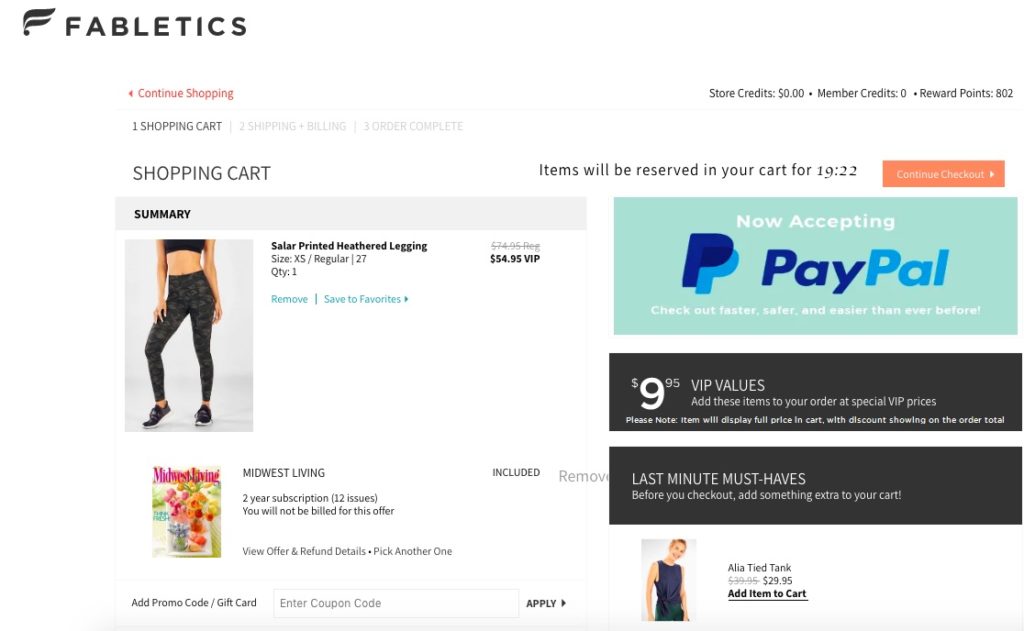
In addition, this checkout screen shows shoppers other items where they might qualify for a discount as well. In this case, the consumer not only gets a discount, but a two-year subscription to Midwest Living.
This shows added value and reinforces the notion you’re providing them with as much value as possible. But the retailer doesn’t stop there.
Fabletics also shows customers what they could save on additional products. This helps encourage consumers to add more to their shopping cart before checking out.

This brand does a great job of being transparent with shoppers while simultaneously encouraging additional purchases.
4. Offer a Guest Checkout Option
There’s no arguing that checkout processes are a great way to collect customer data. But is it worth it to potentially lose customers over? Well, Invesp found 14% of shoppers will abandon their cart because there is no guest checkout option.
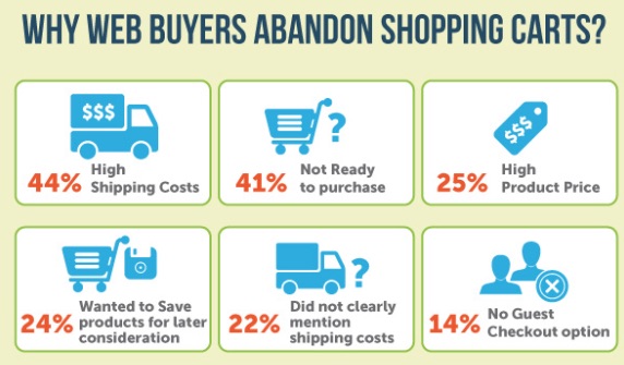
By making checkout as easy as possible for customers—meaning they make a purchase without additional steps to create an account—you increase the likelihood of them converting.
Urban Outfitters gives shoppers the chance to choose if they’d like to create an account or complete their purchase via the guest checkout option.

With this method, Urban Outfitters is still able to collect customer email addresses, which can be used for future campaigns. Sacrificing a bit of customer data in order to make things easier for your customers may prove to be worth it.
5. Limit the Number of Steps in the Purchase Process
This seems like a no-brainer, but make your checkout process as easy as possible to reduce customers bailing at the last second. A Statista report found 25% of shoppers abandon their carts due to a confusing navigation.
Amazon’s checkout window is not only easy to understand, but it’s simple to make changes within the cart. Each stage of the buying process is clearly outlined for customers, which eliminates confusion and cart abandonment.
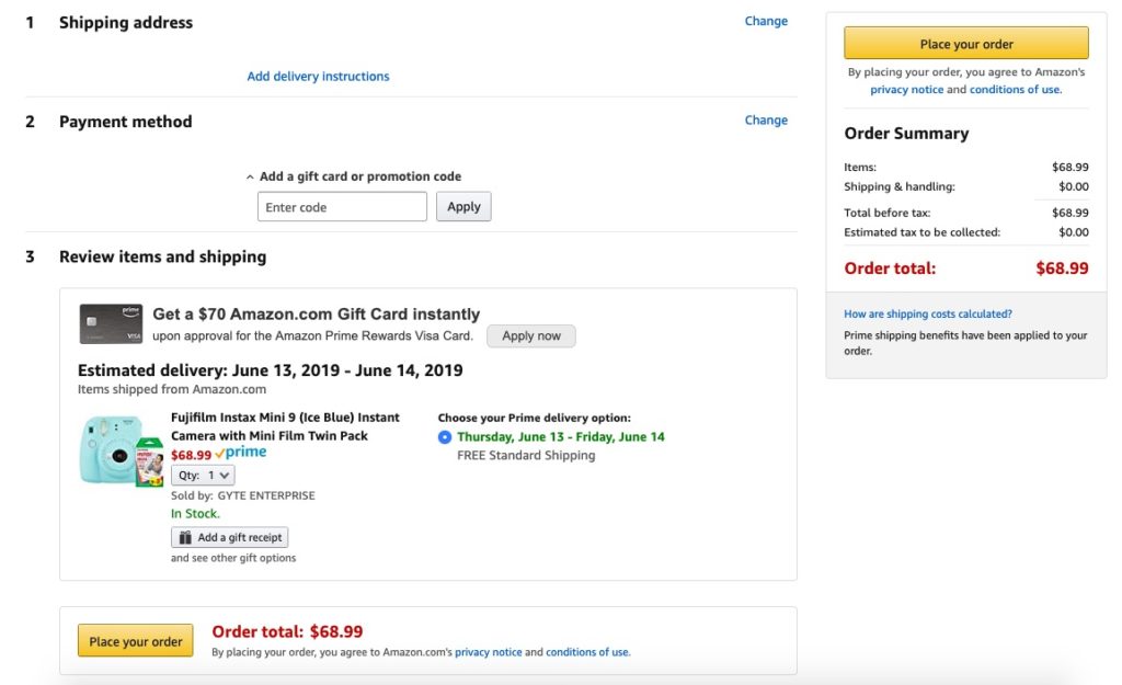
So what’s the best way to adjust your purchase process?
Look at your current checkout screen and identify anything that could be streamlined or eliminated. Consolidate the number of screens shoppers navigate through to buy.
If this isn’t possible, an order progress bar is a great way to visually show customers their process. Lastly, include any relevant information on the final checkout screen before they place their order. The last thing you want is to leave out important information and increase the likelihood of more product returns.
6. Create a Shopping List Feature
It’s normal for customers to be unsure when in the path to purchase, especially at the beginning stages. In fact, an additional Statista study discovered 17% of customers abandon carts because they plan to purchase at a later time–not because they don’t want to buy.
A great solution is to implement a wishlist or “save for later” option that gives shoppers the opportunity to return to lists later on—like when they’re ready to make a purchase.

If you want to compete with Amazon, take a page from their book and allow consumers to create wishlists or add items to a list all within the cart. Let customers share lists with friends too, which makes it really easy for wedding and baby registries.
Lists are also a great opportunity to collect data on customer shopping behaviors. With that information, you can send post-purchase emails and promotions regarding certain products. You could also jump on the opportunity to reach out to customers and see if they have questions.
7. Leverage Retargeting Campaigns
It’s time to put all that customer data you’ve been collecting to good use.
Retargeting is a great way to re-engage customers and encourage them to convert. It’s arguably one of the best tactics for brands to use to resonate with customers.
But what is it exactly?
Neil Patel gives a great break down here, but essentially, retargeting is a tactic that shows customers relevant offers based on their behavior online. So if a customer visits a product page on your website then clicks off the page, you can use retargeting to remind them with an attention-grabbing ad.
Facebook is a great way to make retargeting an easy part of your cart abandonment strategy. Using the Facebook Pixel, you can collect customer data through your website or app activity which can then be used to create a retargeting ad.
You can also use customer contact information for retargeting campaigns too. Remember those email addresses you collected with your guest checkout feature? Retargeting is a great opportunity to use those emails.

This ad from Glossier is a great example of the power of retargeting. The makeup brand used video to re-engage with customers.
For example, this is where a customer goes to the site and views a product. But in the image below, this is what a customer sees on a Facebook ad for the same product they viewed previously on the brand’s website. The connection is seamless and simple.

Glossier used retargeting to show customers another side of the product. In this case, they used a video of a model using the product, which is more engaging than a static image. This ad also includes two calls-to-action—one on the video screen and a button below the video—which gives customers more opportunities to click.
8. Increase Trust During the Checkout Process
Even in 2019, some customers are wary of entering credit card information online–especially if you’re a new or upcoming brand. Online privacy concerns are at a high, which is why it’s not surprising that 15% of customers report a lack of security at as a cart abandonment reason.
However, there are a few ways to make consumers feel more at ease when purchasing products online:
- Security logos: Include the logos of trusted, secure payment sites to reassure customers that your site is legitimate and safe.
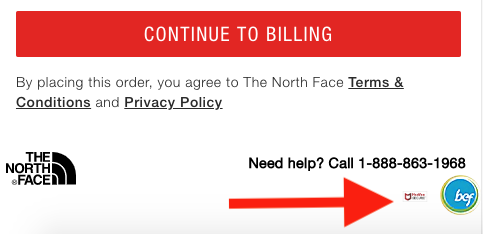
- An SSL Certificate: SSL certificates are small data files that bind a cryptographic key to a site, which ensures a secure connection whether it’s for a credit card transaction or for transferring data.
Both of these measures make customers feel more confident their information won’t be compromised and that checkout is secure.
9. Offer Various Payment Options
We know the easier the checkout process, the more confident the customer feels making the purchase. Offer multiple payment methods to fuel that feeling.
With more payment options, customers make the decision that’s easiest for them–whether it’s a credit card, PayPal, Amazon Pay or Apple Pay. Convenience is critical for payments.

Also, offer payment plan options for higher-priced items to get customers to convert as well. Paying a fraction of the cost up front may be easier for some customers, especially if they really want the item.
10. Be Creative With Cart Abandonment Emails
Cart abandonment emails are a popular tactic for ecommerce brands. And when done right, they yield great results. In fact, BigCommerce found recovery rates in shopping carts have gone up by as much as 36% with compelling content and higher open rates.
But how can you make these emails stand out among the sea of emails your customers receive daily?
A great way to make your cart abandonment emails stand out is to highlight highly-rated items in their cart with ratings and reviews and quality product imagery. PowerReviews makes it easy for brands to collect and display customer reviews in an engaging way to encourage purchases, which can be used in these emails.

This cart recovery email from Adidas is simple, yet packs a punch with product imagery and clever copy. Adidas gets consumers to read reviews from other customers and it’s easy to click back to the cart and convert–thanks to the two call-to-action buttons.
11. Identify Gaps in Your Checkout Process
Your checkout process matters more than you may think.
If you’ve noticed a major spike in your cart abandonment rate, it’s a good idea to audit your existing checkout process. An audit allows you to identify any areas of your process that could be improved or adjusted to help the customer along.
A separate study from Baymard found that website errors or crashes accounted for 17% of customers who left their carts. While auditing your process, keep the following in mind:
- How long does it take to checkout with your current process?
- Is it clear what items are in the cart as well as what the total cost is with additional fees?
- Is there anything that could spark a potential issue for a customer?
12. Provide Every Product Detail
Shoppers need confidence in their purchases, which is why you have to provide them with everything about the product. Without being able to physically touch an item before buying, it’s up to the ecommerce site to provide thorough product details to consumers.
This is why PowerReviews provides a customizable Review Snapshot. You simply choose the features you want on your product pages, like Size and Fit, Pros and Cons or searchable question and answers.

Additionally, our Social Collection features allow brands to showcase user-generated content from your own shoppers, so consumers get a better idea of exactly what they’re buying. Make your shoppers confident in their purchases by giving as much product information as possible.
13. Build Stronger Product Pages With Online Reviews
What better way to make your customers feel more confident about their purchase than with product pages that go above and beyond? Product pages packed with customer reviews, honest ratings, product details and high-quality product photos can be the difference between customers converting.
Reviews, in particular, are an excellent way to further establish customer trust. According to BigCommerce, the more reviews you have, the higher your conversion rates. In fact, you could see an increase as much as 4.6% just by adding 50 reviews to a product’s page.

PowerReviews customer Room and Board found similar success by leveraging reviews on their product pages. The retailer saw a conversion rate increase of 95%, which was attributed to customers reading reviews or Q&A sections of the product pages.
What’s more, 30% of sales have come directly from reviews—both online and in store. Customers trust the opinions of other customers. Again, transparency on product pages helps solidify a customer’s trust in you.
14. Make It Easy for Customers to Contact You
Another excellent way to build trust with your customer is to make it easy for them to contact you in case they have a question about a product or their order. Live chat bots especially can reassure customers that you’re only a quick chat away.
This boutique women’s clothing shop uses a live chat widget to make it easy for customers to get in touch at any stage of their journey. The button is discreet, so it’s not interfering with the shopping experience.
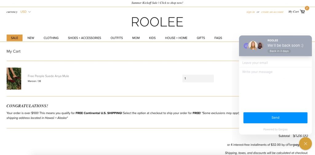
This chat feature is also readily available in case customers have a question about sizing, price, discounts or shipping. That’s why it’s smart to opt in for good old-fashioned email and ticketing customer service to tackle shopper questions and issues.
However, if you decide to structure your customer service process, make it clear how you can be contacted. Bonus points to you if contact information in the checkout window and in order confirmation emails is included!
15. Invest in Mobile Checkout
Here’s some online shopping statistics to consider–nearly a quarter of online purchases are made through mobile devices and 90% use mobile devices to help make a purchase even in store.
What’s worse? Data from Adobe showed only about half of landing pages were set up properly for mobile. If you’re not convinced about the power of mobile, you’re probably not seeing a lot of sales here in the first place.
Let’s fix that.
Easy to navigate mobile checkouts are a great way to limit cart abandonment. Make sure buttons are large enough to click and clearly make sense.
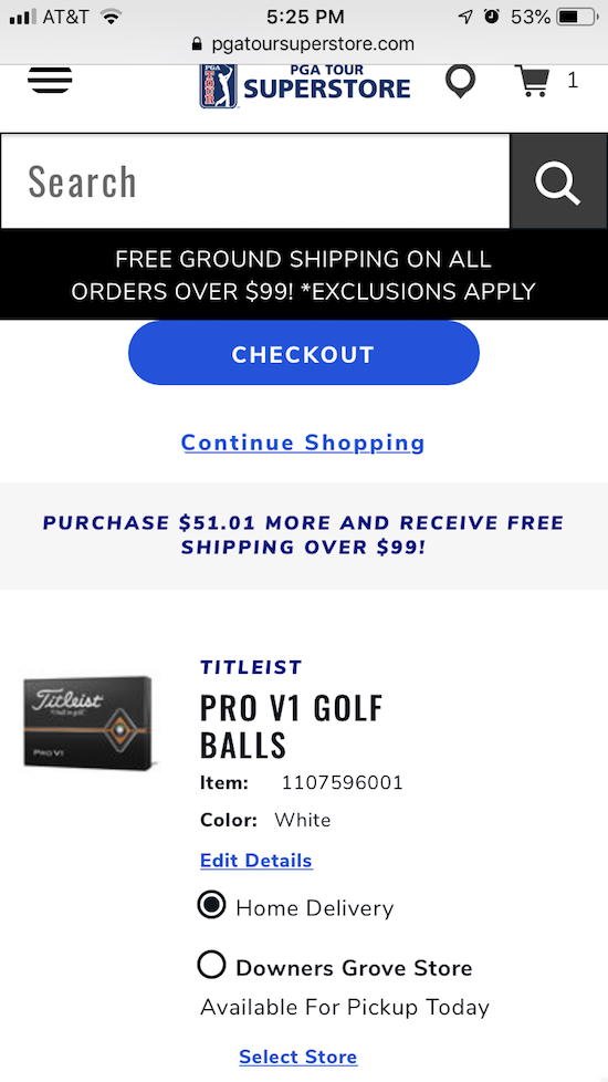
PGA Tour Superstore does a great job at highlighting the checkout button on mobile at the top of the screen and allowing shoppers to buy online, pick-up in store or home delivery. Additionally, they give their CTA plenty of space to alert buyers of orders that earn free shipping.
16. Invest in SEO
SEO is quickly becoming synonymous with everything marketing and appears on resumes about as much as experience with Excel. All the talk about SEO makes some businesses hesitant to fully invest.
However, SEO for ecommerce is essential to limiting cart abandonment. How? For starters, it’s all about page speed. If you’re using any sort of third party product, even say PowerReviews, we’re going to add code to your landing pages, and SEOs will not like that.

With so many scripts, it can significantly slow down page load speeds, causing abandoned carts. But with PowerReviews intelligent script loading, we only add the code you need for each of our features.
This significantly limits the amount of script on your site and can help limit any page speed problems, making SEOs very happy. Additionally, SEOs will help you keep your product page content filled with the appropriate keywords.
Rank for more long-tail keywords and increase your overall reach on search engines with better SEO strategies.
Cart Abandonment Is a Solvable Problem
Reducing cart abandonment rates boils down to testing different methods to see what’s best for your brand and customers. You customers are at varying points in their buying journey, so creating a checkout process that makes them feel confident and secure can make all the difference.
Looking for a way to reduce your cart abandonment rates with customer reviews and ratings? Reach out today and connect with one of our experts!


