While every section of your website needs to be optimized, your product pages deserve extra love and attention. Why? Because these pages, along with well-written product descriptions, are the parts of your online store that actually drive sales.
In fact, research from Monetate found product detail pages (PDPs) account for a quarter of all ecommerce landing pages. This means your product pages are increasingly becoming the first touchpoint shoppers have with your brand.
So, if you haven’t spruced them up in a while, it’s high time to do so. We recommend starting with your product descriptions because they play a pivotal role in generating both traffic and conversions.
Well-crafted product descriptions do more than just describe your merchandise. When done right, your descriptions convey your unique voice, get people excited and even help you rank on Google.
In this post, we cover the 11 critical elements to help you create winning product descriptions. Check them out and see what applies to your store!
1. A Distinct & Relatable Voice
Product description writing tip No 1: Inject your copy with a unique voice and tone that speaks to your target audience. If you’re a quirky company that caters to millennials, then you’ll want to adopt a casual tone and maybe throw in a bit of humor.
But If the plan is to target executives at large enterprises, your copy would should feel more serious and professional. It all depends on your voice and who you’re talking to.
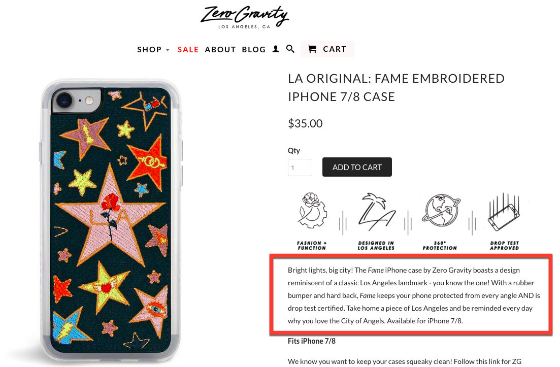
Check out this example from iPhone accessories store Zero Gravity. Each of their product descriptions are written in a casual and fun tone, which is great because Zero Gravity specializes in bold and distinctive phone cases.
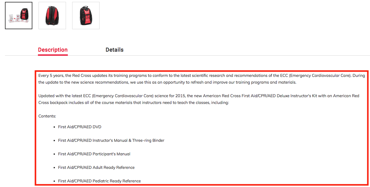
Meanwhile, the American Red Cross uses a different voice and tone to sell items like instructor kits to teach first aid, CPR and how to use an AED in emergencies. The Red Cross uses a more straightforward tone that appeals to importance of information and newest measures to teach.
So why would you go through all the trouble of sprucing up your copy?
For starters, adopting a distinctive voice—especially one that caters to your audience—strengthens the connection they have with your brand. Speaking the language of your customers makes you relatable, builds trust and increases the chances of conversions.
As a bonus, this practice also enables you to come up with unique content, which helps you with SEO for ecommerce. And this brings us to our next point:
2. The Right Keywords
It’s important for your descriptions to contain the search terms that shoppers would use when looking for your merchandise. This gives you a better chance for your product pages to show up on search engines, which in turn drives traffic and sales.
To first step in optimizing your product pages for SEO is conducting keywords research. Use a tool like Google’s Keyword Planner to search for keywords and identify other terms that your customers frequently use.
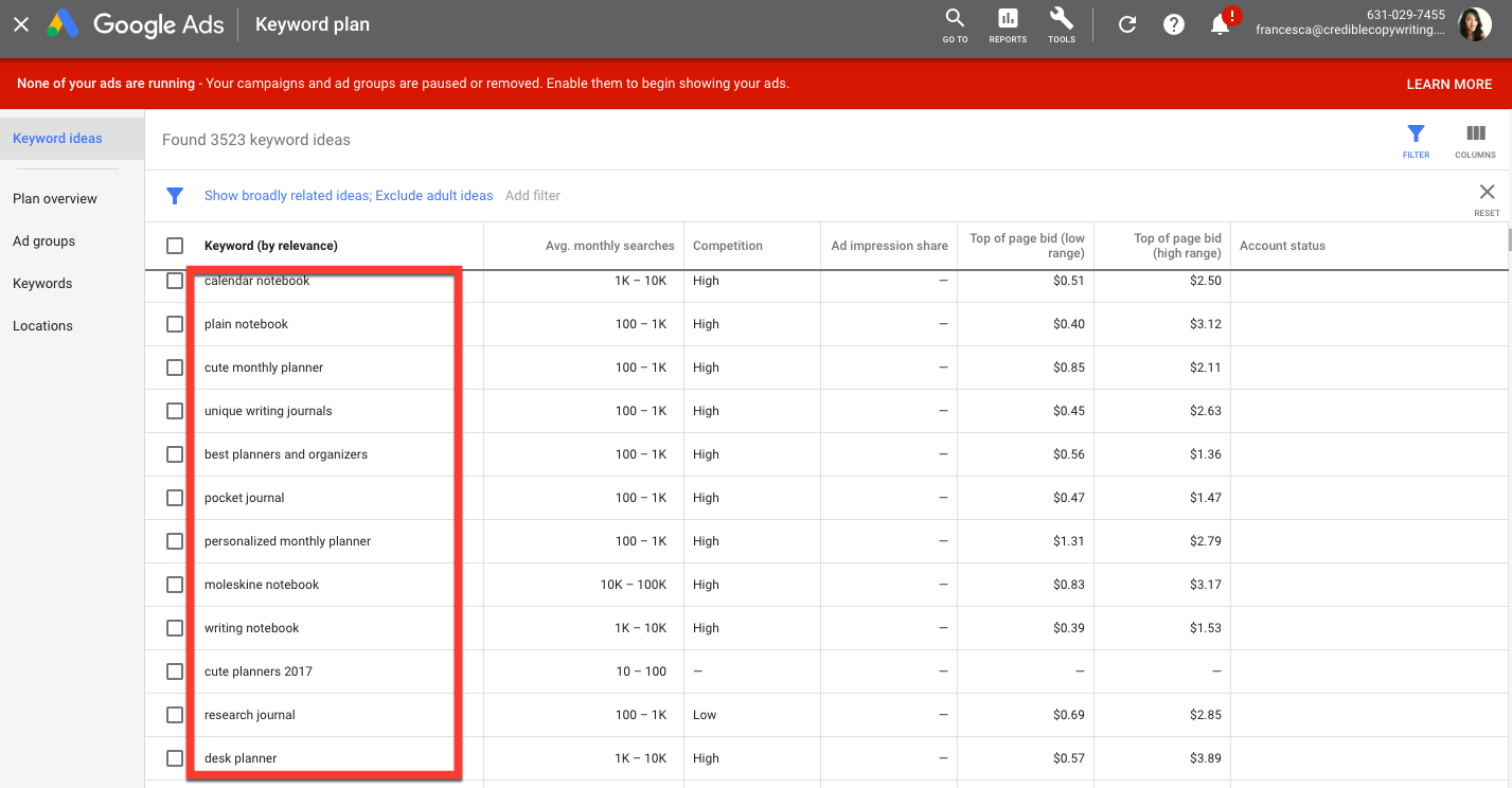
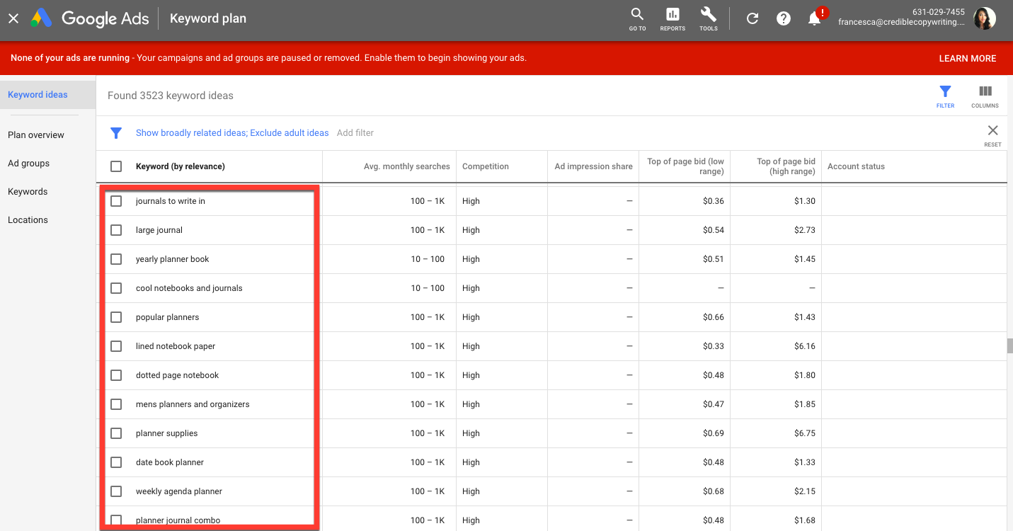
Let’s say you’re selling journals, planners and notebooks. A quick search of those terms on Google’s Keyword planner uncovers a variety of other search terms, including “ruled notebook,” “unique writing journals,” “lined notebook paper” and more.
Depending on your merchandise, you can incorporate some of the keywords you find in your product descriptions.
For example, notice how in their description of an 80 Page Lined Journal Notebook, AnyPromo makes it a point to pepper in relevant search terms into the text.
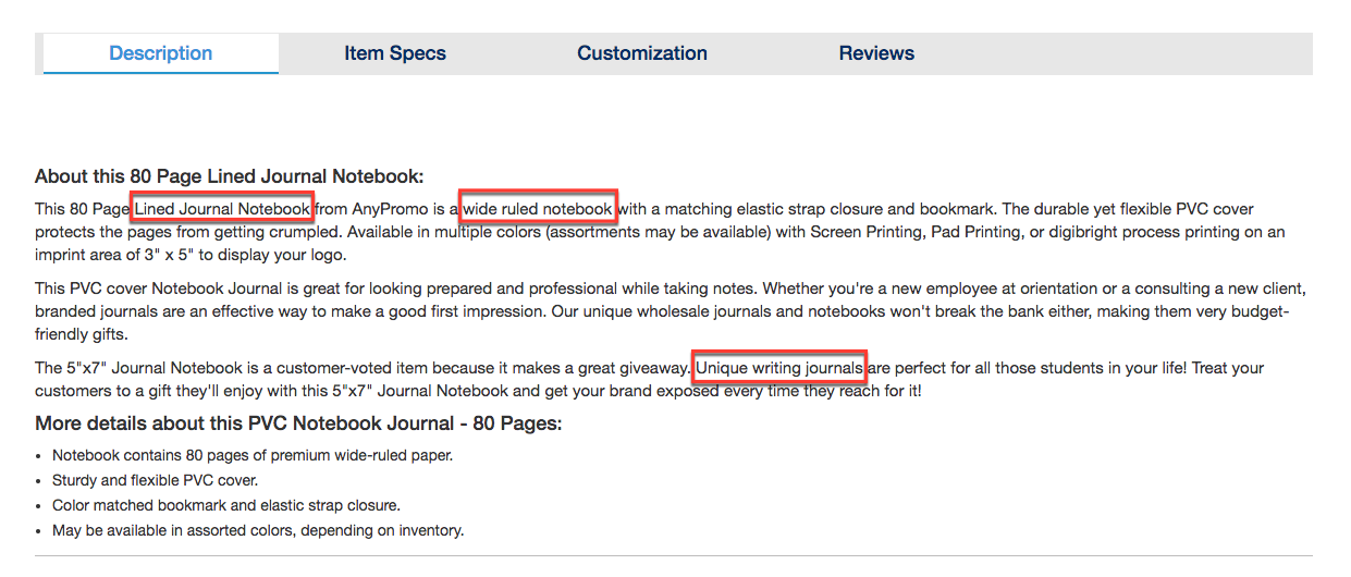
Do the same thing for your product pages. Research the keywords that consumers use when searching for your products, then incorporate those terms into your descriptions. Now, this isn’t to say that you should stuff your description with keywords. Instead, sprinkle a healthy amount of search terms in your copy, while still making it readable and engaging.
Luckily with the help of PowerReviews, we help add structure data to your product pages to get critical and unique review content to be indexed by Google. This means you get more ranking content with the additional reviews you produce.
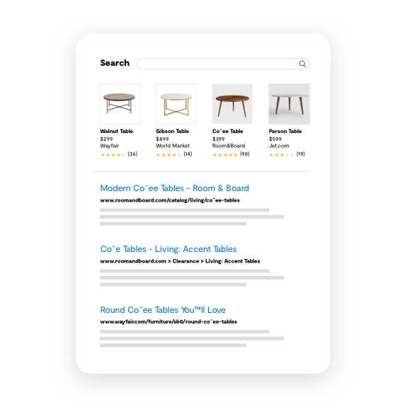
Want to see how PowerReviews helps brands and retailers increase their reviews SEO efforts? Talk to our team today!
3. Showcases Features & Benefits
One of the most common pieces of marketing advice is to focus on benefits over features when describing what you’re selling. People who give this advice make an excellent point.
It really is more effective to tell shoppers how something would benefit them versus just giving them a laundry list of features or capabilities. But this doesn’t mean you should ignore features completely when describing your products. After all, your customers still need to know what a product does and what it’s capable of.
Your product descriptions should have the right balance of features and benefits. They should describe your items and clearly display its specifications, while at the same time, spell out the deeper advantages that each feature brings to the table.
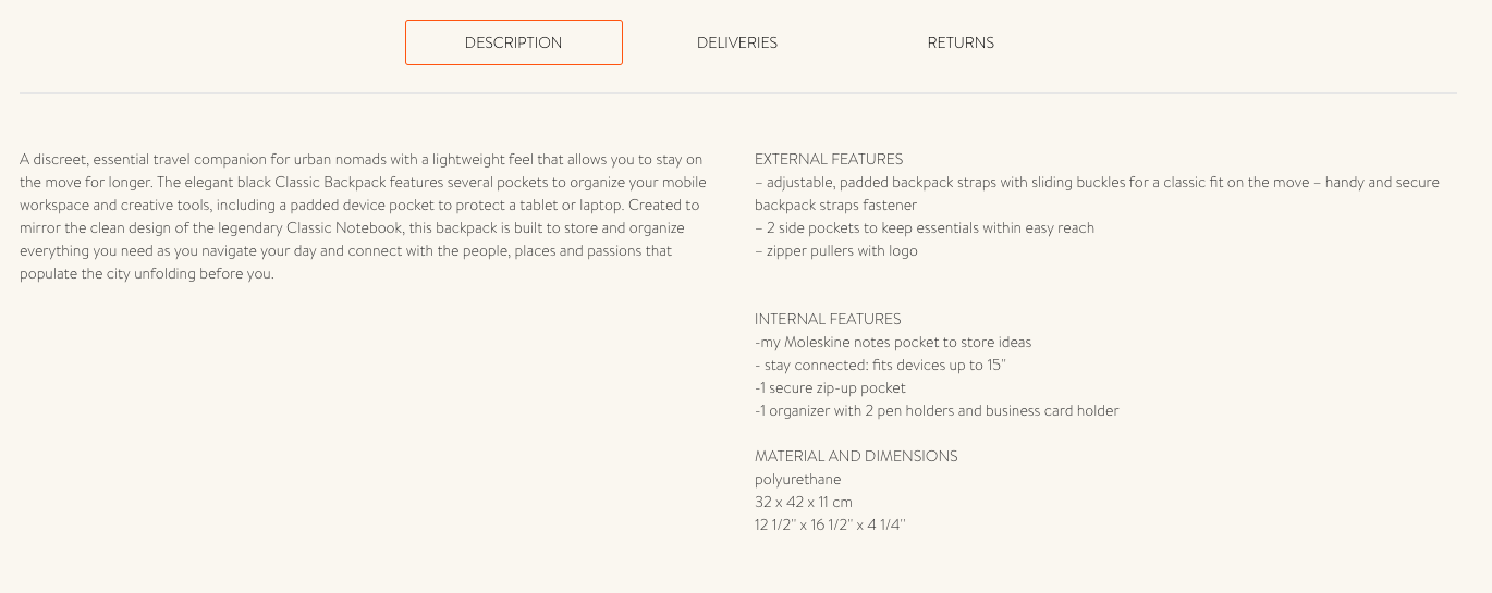
Have a look at Moleskine’s product description for their Classic Backpack. The left column is very benefits-centric.
It talks about how the product helps you “organize your mobile workspace” and how the backpack enables you to “store and organize everything you need as you navigate your day and connect with the people, places and passions that populate the city unfolding before you.”
The right column, on the other hand, is a straightforward list of features. Adopt a similar approach with your descriptions.
Strive to communicate a product’s features AND benefits effectively, while make them easy to find at the same time.
4. Visual Product Variations
Do you sell multiple products with different variations like color, size or print?
You’re not alone. A lot of businesses have various similar products, but don’t show buyers every single option. Some ecommerce folks might think it’s easier to simply show a single image of a variant product and provide more detailed visuals with a specific or high-selling item.
Instead, take the time to get great visual content for every single product you have. There’s no reason to provide fewer images or even videos of a variant product.

No one likes to shop on line and come across this–a small display of images showing the various colors of a sheets for a queen size bed. Before you know it, you’re zooming in and trying to make out what kind of blue is “Lake Blue.”
One of the more important online shopping statistics shows within the next two years, mobile ecommerce is projected make up almost 73% of total ecommerce sales. That means you need to think about the mobile experience and if your customers can see the variant products up close.
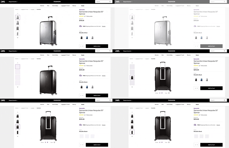
For example, iJet does a fantastic job showcasing the various colors for its Samsonite suitcase. It would be easy to mistake certain colors or see if variant products have different features. But the zoomable and various images give shoppers more confidence to buy.
5. A Good Story
Want your product descriptions to make a bigger impact? Tell a better story. Scientific studies have shown that human brains become more active when stories are told, and people are highly receptive to thoughts, ideas and emotions when they understand a particular narrative.
Depending on your products, it may be helpful to incorporate narratives into your descriptions. Stories make your product descriptions stick. They also help people understand your items better, which ultimately prods them to hit the buy button.
Consider sharing a quick anecdote describing how you came up with a product. Lin Manuel-Miranda does just that in the product description of the “Mr. Write” t-shirt on TeeRico:

See if you can do something similar for your products. Find a tidbit or anecdote to describe an item and incorporate it in your copy. It could be just the thing that makes you stand out.
6. Easy to Scan the Page & Copy
Part of ensuring your product descriptions are easy to digest is by making them scannable. Scannable text looks more appealing and encourages people to give it a read.
Here are some of the things that can help shoppers easily scan your copy:
- Short paragraphs: Walls of text make your copy look lengthy, which often bores people away. You’ll want to keep your paragraphs short (i.e., 4 lines or fewer) and succinct.
- Headers: People on their phone or computer tend to scan product descriptions to find information relevant to them. Help them do that by using headers that break up your content into sections.
- Bullet points: Lists and bullet points make text easier to read, particularly if you’re communicating product specs and features.
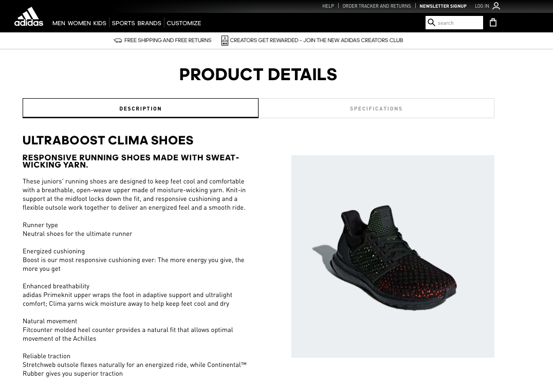
Adidas does all three in its Ultraboost product description, with one tab focusing on features and benefits and a second tab listing the shoe’s specifications.
The specifications tab, we get down to the nitty gritty details of the product, which might not be as relevant for some shoppers, but still important to display.
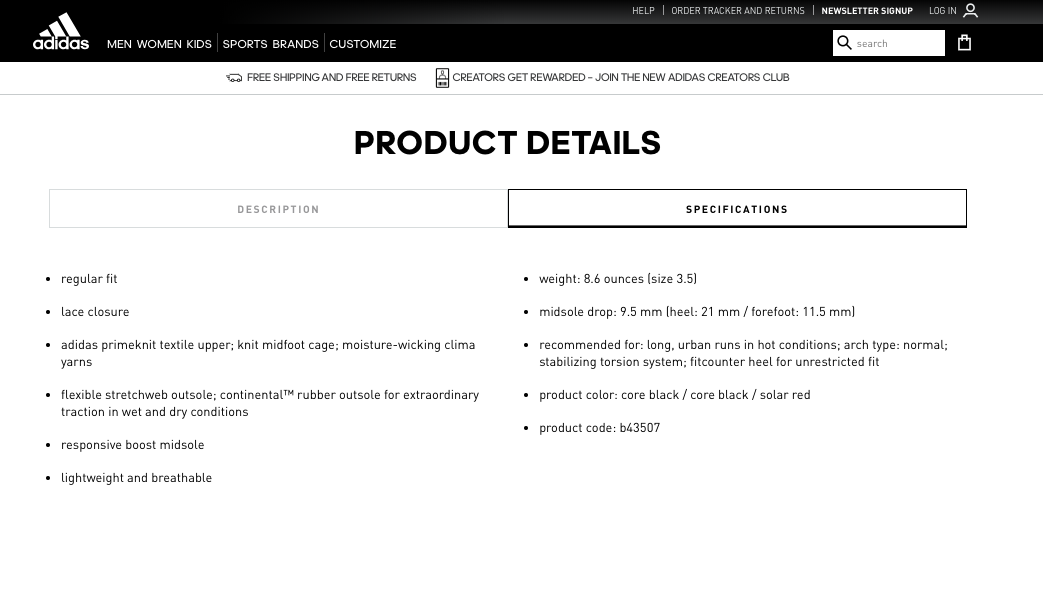
This helps consumers know more about the product quality and the materials you chose. As more shoppers focus on organic and sustainable products, it’s essential to keep these details available on product pages, but obstructing the description with too long of text.
7. Social Proof
The importance of social proof (i.e., ratings and reviews, customer photos and endorsements) in your product descriptions cannot be understated. Our own research at PowerReviews discovered around 97% of consumers factor in ratings and reviews when making a purchase and 88% specifically look for photos and videos from other consumers.
Clearly, social proof is critical to creating compelling descriptions, which is why you should incorporate them into your product pages whenever possible. Consider the following:
Ratings & Reviews
We’ve already established that ratings and reviews influence consumer decisions to make a purchase, but did you know having them on your product descriptions also lowers your return rates? Based on 10 years of working with over a thousand brands and retailers, we’ve found that companies see a 20% reduction in product returns for items with ratings and reviews.
So, how do you get more of them on your product pages? Start by actively encouraging customers to rate and review their purchases. Send a post-purchase email asking them to provide feedback, and if possible, throw in an incentive for them to do so.
Nordstrom, for instance, encourages shoppers to review their purchases by giving them a chance to win a $1,000 gift card.
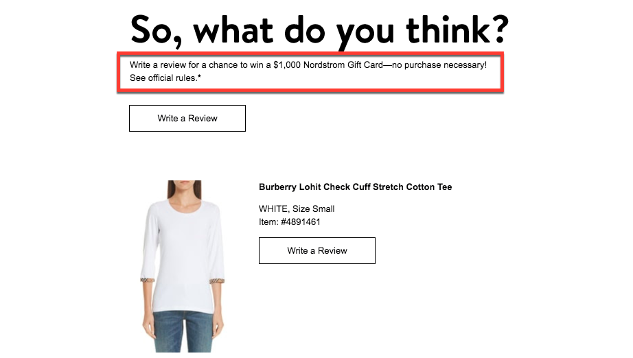
Once you have those ratings and reviews, display them prominently on your product page. Have the star rating as one of the first things people see when they’re on the page, and make sure your ratings and reviews section is prominent and easy to find.
Take the clothing company SCOTTeVEST. In addition to displaying an item’s star rating at the top part of the page, SCOTTeVEST shows the star rating again right above the written reviews section.
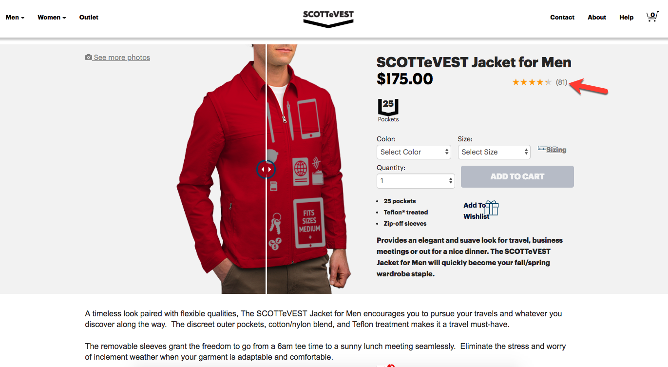
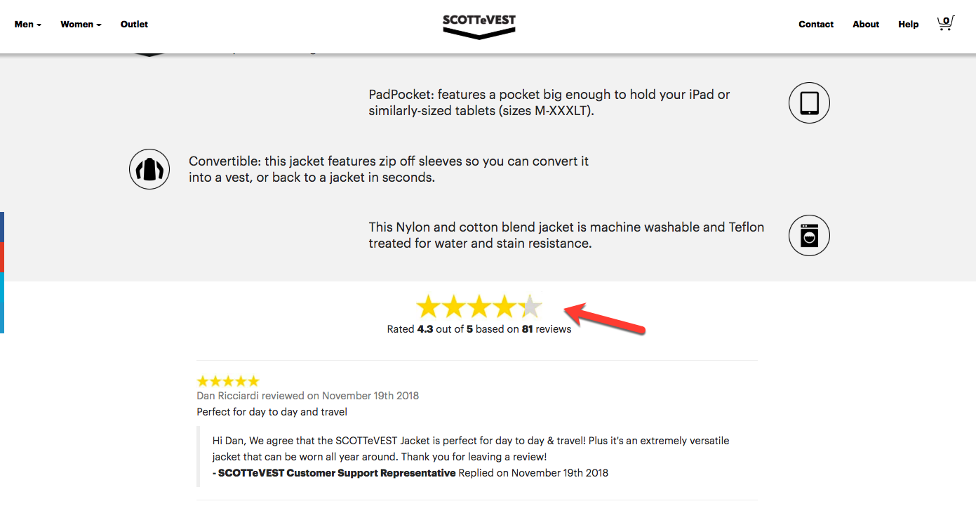
What about you? Do you display your ratings loudly and proudly? If not, take a leaf out of SCOTTeVEST’s playbook and make your product’s star ratings more prominent.
Customer Images
The rise of user-generated content (UGC) has changed consumer expectations when it comes to retail visuals. Professional product photos are still essential, but if you want to build trust and convey authenticity, you need to go a step further by including images from other consumers. A study by Olapic found that 63% of U.S. consumers trust customer photos more than brand or retailer photos.
You can easily promote UGC by adding a feature on your product page that lets customers upload photos of themselves using your products. One retailer that’s doing this well is SheIn, which has an upload feature that allows customers to include photos with their reviews.
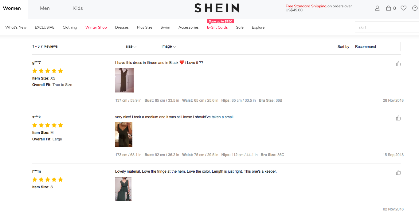
Try to do the same thing with your product pages. Encourage your customers to snap and share photos of themselves while using your products. With PowerReviews, we provide user-generated content visuals for products that help shoppers understand the product more thoroughly.
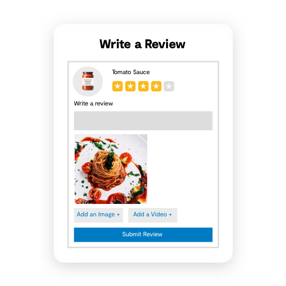
In fact, our Snapshot of Ecommerce report found 58% of those between the ages of 18-29 find user-generated content important or very important in their purchasing decisions.
Why limit what your shoppers need to make better decisions? See how our Visual and Social Suite helps you generate more authentic content.
8. Excellent Visuals
Fact: human beings are visual creatures who process image data better and faster than text. For this reason, it’s important to include several visual elements in your product descriptions. Aside from your official product photos and the user-generated content mentioned above, consider adding the following visual elements:
Videos
Videos are great when you want to show your products in action, and as it turns out, they can also drive sales. In the fashion industry, it’s been found that video increases conversions by 134%.
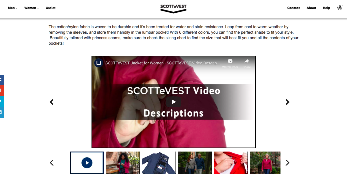
SCOTTeVEST, once again, is doing a great job here. All of their product pages have video descriptions that demonstrate the unique features of each item.
Diagrams
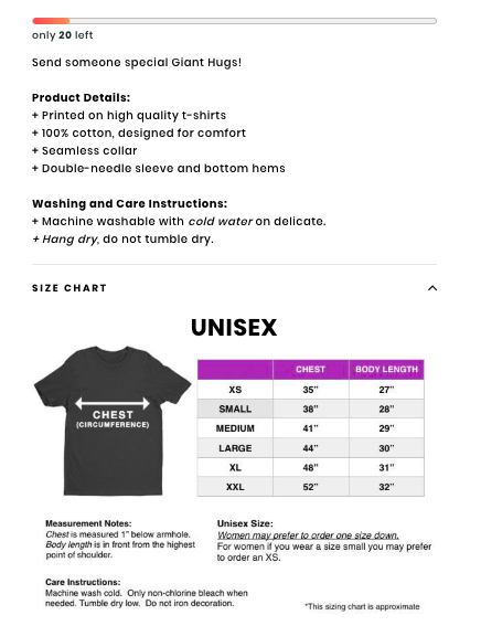
Diagrams serve as effective visual aids for conveying the size and scale of an item. On Giant Hugs, for example, they have size charts that you can access right from the product page to get a better idea of the size and fit of each piece.
9. Trust Signals
Consumers are certainly more comfortable when making purchases online, but many still experience fear or hesitation when it comes to buying something they can’t physically see and touch.
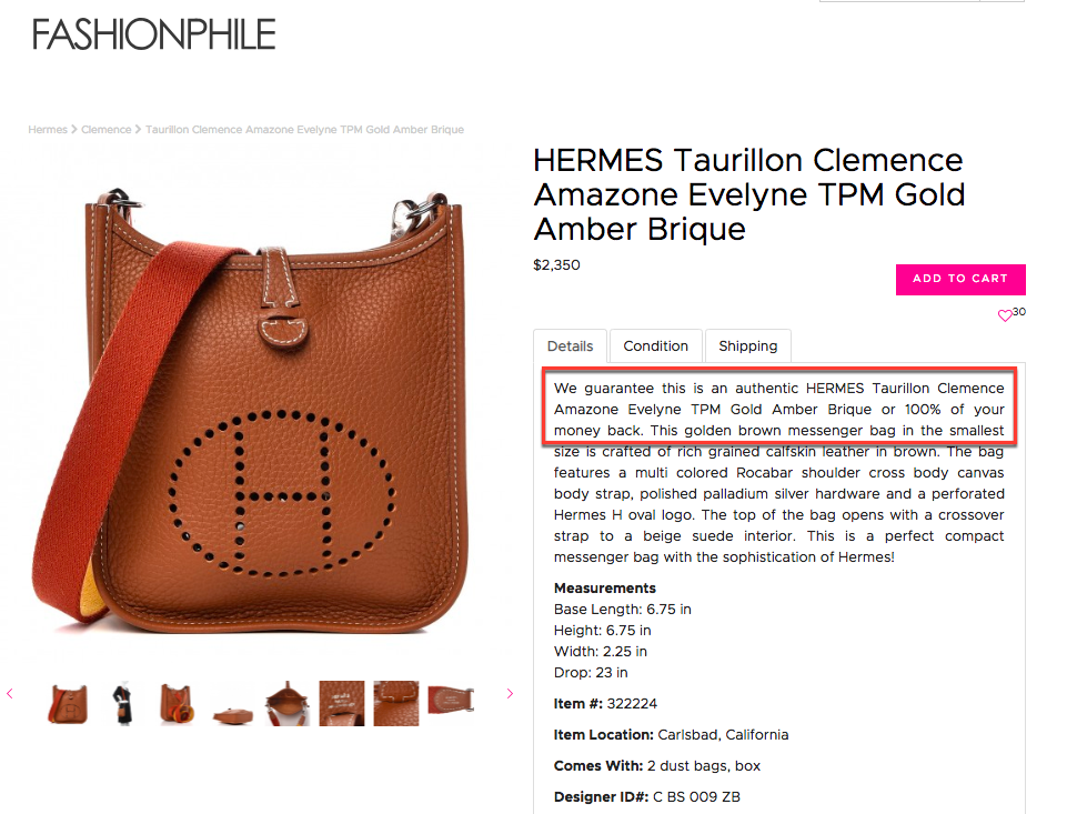
While things like great copy and customer photos certainly build trust, you’ll want to go a step further by throwing in additional trust signals in your descriptions. Money-back guarantees or certificates of authenticity alleviate any misgivings that people have about purchasing your products, so include them whenever you can.
This company, which sells pre-loved luxury goods, Fashionphile, does this on all of their product pages. Fashionphile’s descriptions always spell out their money-guarantee to quell any concerns shoppers may have about purchasing from them.
See if you can do the same thing with your product descriptions. If you offer any guarantees, communicate them clearly in your text to alleviate trust issues and be on your way toward building brand loyalty within customers that will come back and rely on you in the future.
10. Relevant Offerings
Advertising your promotions on the homepage is great. But make sure you include those sale and offer details in your product descriptions as well.
Check out what Guess Factory is doing. In addition to prominently display the sale price and discount on the top of the product page, Guess’ product descriptions also have a line reminding shoppers of their new arrivals promotion.
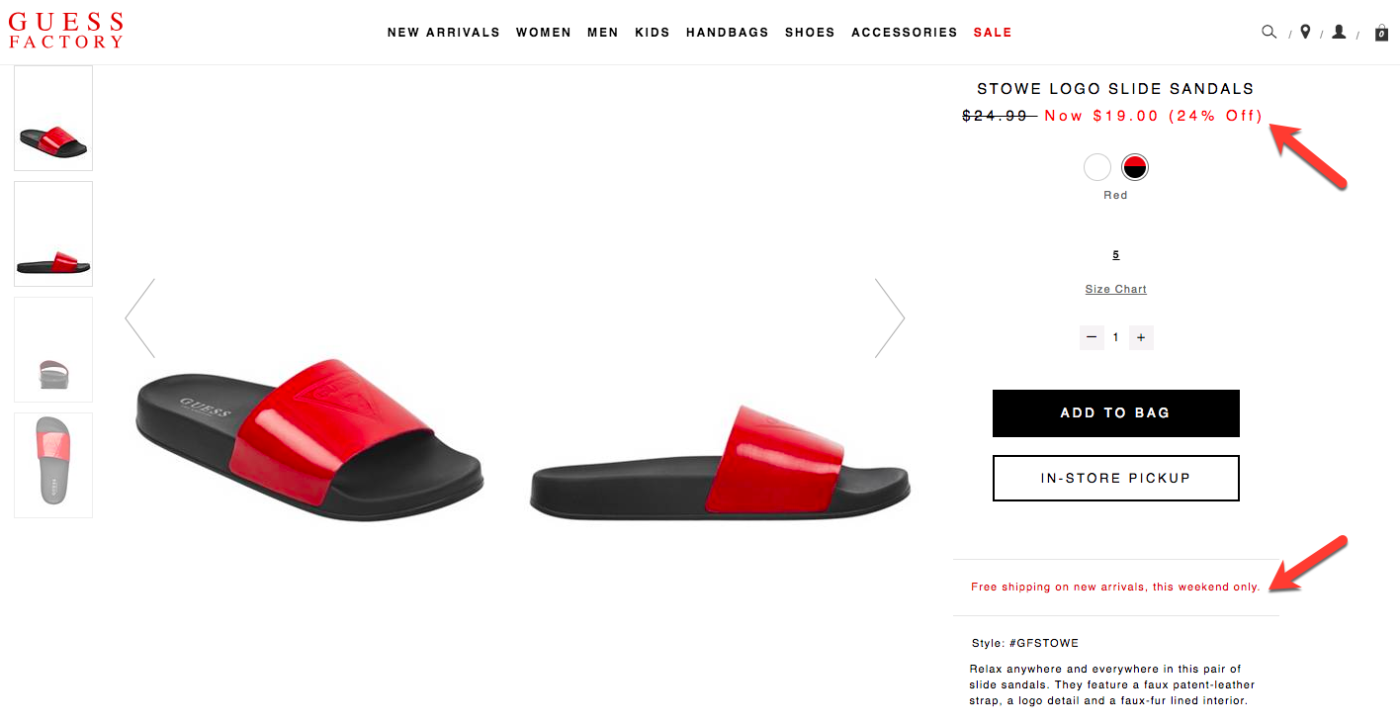
Remember, a good chunk of shoppers are likely bypassing your homepage and going straight to your product pages. You want to make these users aware of any offers available that might’ve been missed on another page.
Follow in the footsteps of GUESS by spelling out your offers in your product descriptions.
11. Provide Answers to Your Product’s Most Pressing Questions
See to it that your product descriptions answer any questions that shoppers may have. Failing to do so could lead to site abandonment. According to Forrester, approximately 55% of shoppers in the U.S. abandon their online purchase if they can’t find a quick answer to their product question.
Yikes.
When writing your descriptions, go beyond simply telling people about your products. Consider any questions or concerns people have about your product, and then address those in the copy.
You can also consider adding a Question and Answers or FAQ section on the product page itself so shoppers find the answers they need easily. PowerReviews offers Q&A software to do just that.
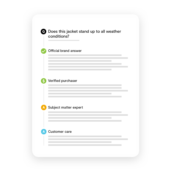
Make it easy for your customers to access important product questions and see who is actually writing the answer with review badges. And for all the brands out there, it’s essential to make sure your customers are getting the appropriate answers on your retailer sites.
That’s why we created Brand Engage, a tool for brands to answer directly to customers on retailer sites that participate in the Open Network.
For example, PING Golf sells plenty of equipment and accessories across retailer sites like the PGA Tour Superstore. But what if someone has a question about a driver that maybe only the brand would know?
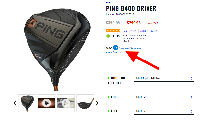
With Brand Engage, PING can answer questions directly on PGA Tour Superstore’s retailer site to give buyers the confidence to click buy.
Take Your Product Descriptions to the Next Level
Great product descriptions go beyond stating facts about your merchandise. Much like a high-performing retail store associate, your descriptions should engage shoppers, build trust and ultimately sell your products.
Are you happy with your product descriptions and ready to take it to the next level? How are you planning to improve them?
Share your thoughts in the comments.


